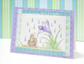
Hello everyone! The colors that Mary chose for this week were unusual - meaning they're not the colors I am used to working with...but after making this card, I realize that I should be using colors like these more often - the white cardstock contrasts crisply with the dark colors (that's why I made a second card, and this time with dessert!)! What's more I had fun naming this card, LOL! I have more details in my blog - if you don't see the details, I'm still updating it!
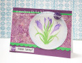
***Ooops, excuse my use of yellow, I thought that the color Lemon Lime Twist was like a light lemony yellow - now I see that it's actually a light yellow-green! Sorry!
- Red-faced-over-a-yellow-that's-more-green -
Date: Monday, February 19, 2018 GMT Views: 1271
Favorited:4
Registered: April 16, 2008 Location: Meridian, Idaho Posts: 8513
Mon, Feb 19, 2018 @ 7:55 PM
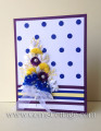
Very fluffy indeed, and so very pretty! Love the beautiful dot and strip background, which is such a wonderful contrast to your gorgeous floral bouquet. Wonderful card!
------------------------------ Stef
Splitcoast Color Challenge Design Team Splitcoast Dirty Dozen Alumni
Registered: August 21, 2007 Location: Wayland MA Posts: 106691
Tue, Feb 20, 2018 @ 11:45 AM
I think your card is awesome.....the white is so good at separating the colors!
------------------------------ Anne HarmonFS154, QFTD58, PROUD FAN CLUB MEMER In and out of the hspital for months. Finally had back surgery on 5 herniated disks. Avatar is great grand Owen, who at 6 months is 19 1/2 pounds, and VERY LONG!! No teeth yet.
Splitcoast Dirty Dozen Splitcoast Challenge Hostess Proud Fan Club Member
Registered: September 24, 2007 Location: WA Posts: 15245
Tue, Feb 20, 2018 @ 1:47 PM
Gem, this is a stunning card! I love the bouquet of flowers, so artfully arranged against the bold polka dots. Wow!
------------------------------ Barbara Splitcoast Dirty Dozen My website: Inky Fun SCS Fan Club Member Color Challenge Team Member QFTD215 Featured Stamper FS1005