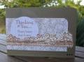
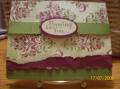
I actually got the idea for this layout from the new catalogue. I just love these colors together. I tried to distress the top two layers. I shaded the background stamp with two colors of markers. Is that thumping? Oh, well, I like it! What do you think?
Date: Friday, July 17, 2009 GMT Views: 1799
Favorited:37
Great card- Love rich razzleberry so much-wish we had it here in Oz. I enjoyed visiting your gallery this afternoon and found lots of cards that I loved and faved-Thanks!
Registered: December 14, 2004 Location: Posts: 1336
Sat, Jul 18, 2009 @ 11:27 AM
This is gorgeous! The color combo is so pretty and your double colors on the damask stamp was a great idea and goes so well with the tearing and distressing.