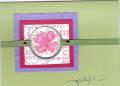
This card almost drove me crazy! I know, short trip! What easier colors and sketch could there be?
I guess the problem was trying to make my colors right. How hard can that be? Let me tell you... First of all, my new colors haven't arrived yet. I had to use Bashful Blue. I stamped the flowers on the colored cs in the same ink. It was plain so I sponged the edges with the same color ink. When I got to the bashful blue piece it looked too dark. I realized I had sponged on bordering blue instead. Oops! The only way to fix it was to use regal rose on the pink and almost artichoke on the celery. I also stamped each panel in Linen BG in Celery, Pretty in Pink and Bashful Blue. Now what color to use for the bg piece and what stamp to use. I chose bashful blue and Floral. The white piece with celery sponged on is crimped. Now things got smoother, thank goodness! I used pretty in pink for the card with weathered bg and "happy" in stamped in bashful. The word is actually from a stamp that says Happy St. Patricks Day, from the retired set, More Great Greetings. Now that you know the story, Thanks for Looking. (I still haven't decided if I like it or not.)
Date: Wednesday, July 26, 2006 GMT Views: 1074
Favorited:12
Registered: August 9, 2005 Location: Tampa, FL Posts: 16812
Wed, Jul 26, 2006 @ 3:35 PM
I think it's a beautiful card.
------------------------------ Jerri Kay My Gallery My Blog - A Touch of Grace Shout to the Lord, all the earth let us sing, power and majesty, praise to the King!
It came out great! We are always our worst critics, as I am sure you know. You should reward yourself for recovering from that slight "deviation from the plan"!
Eileen
------------------------------ When the power of love overcomes the love of power, the world will know peace.
Registered: February 8, 2006 Location: Posts: 6471
Wed, Jul 26, 2006 @ 5:42 PM
It may have been frustrating getting there but it turned out great in the end! It is very cheerful and nicely laid out. I think your bordering blue "mistake" was a good thing because the darker colors around the edge give the panels depth. Great job!


 lexi
lexi