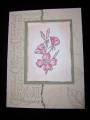
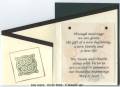
floral stamped in celery, linen in bashful blue on top. linen in choc chip stamped off once on top of birdie. I cut the dang window and forgot the slit punch, :rolleyes: so I used the hardware for the closure. Don't beat me or send the challenge police Bethie!!! :mrgreen: Stickles used for the center of the prima flower. Is that ribbon too bright? Maybe I should have sponged it a little.....story of my life.....:rolleyes:
Date: Thursday, March 16, 2006 GMT Views: 3197
Favorited:60
Registered: September 16, 2004 Location: Posts: 23
Thu, Mar 16, 2006 @ 4:05 PM
Very neat card. I like the way it opens and using the HPH as a closure. The ribbon looks good, not too bright. Definitely put this one in my picture file.
Registered: December 29, 2005 Location: Colorado Springs, Colorado Posts: 1230
Fri, Mar 17, 2006 @ 5:03 AM
looks awesome! great distressing, great coloring, great layout! sometimes mistakes really turn out better. only in your mind. because you meant to do something else, does it not look good. Not knowing what you meant to do, this turned out great to me! so, quit it! You are supposed to say 'I meant to do it this way to be different' TFS! bb
------------------------------ Check out my Stampin' Up! Website: www.bevdahl.stampinup.net Loot out! Here comes another idea!


 TFS! bb