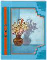
I have tried copic markers, colored pencils, watercolors and everything is too glaring against all the shadedness of the stamp itself. So....I got out Vintage Photo disstressed ink and a duste bush and went for it. I really like how it turned out but toning down the colors and made it look more ethereal and secluded.
Date: Tuesday, June 24, 2008 GMT Views: 246
Favorited:6