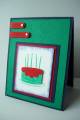
I have to just say that I love color challenges because they make you explore color combo's you would never have come up with yourself. On that note, I should say that this is one I really don't care for! I'm not much of a "bold brights" person, so this one was a bit tough for me!
I thought they seemed kinda "juvenile" when I looked at the cardstock all together so I went with that. I thought this would be okay for a boy's birthday card.
I didn't have glorious green ink so I had to use Brilliance's closest shade.
TFL, let me know what you think!
Date: Wednesday, April 9, 2008 GMT Views: 715
Favorited:4
Paper: glorious green, night of navy, real red, whisper white
Ink: Brilliance green, not quite navy
Accessories: word window punch, round tab punch, large primary color eyelets, navy, white and red grosgrain, Cuttlebug and folder, Stardust stickles, crop-a-dile
Splitcoast Dirty Dozen Alumni Creative Crew SU Design Team Alumni Demo Challenge Leader Splitcoast Challenge Host
Registered: February 8, 2004 Location: South of Oklahoma, North of DFW Airport = North Texas! Posts: 44446
Wed, Apr 09, 2008 @ 8:20 PM
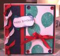
I know ... this was a tricky color challenge for me as well. But I think you nailed it with the juvenile b'day ... the balloons + stickles are terrific!