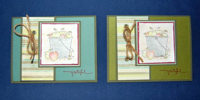
I've been working on this card and I just can't decide which background color to use. I know it's a subtle difference, but I also think it really changes the overall 'look' of the card.
All suggestions appreciated!
Date: Tuesday, August 28, 2007 GMT Views: 837
Favorited:6
I like the one with the green background best. Your main image is a light color so, to me, it looks better on a darker background. It makes a person notice it more. But both are very nice.
Registered: February 7, 2006 Location: Beautiful View, PA Posts: 9231
Tue, Aug 28, 2007 @ 10:00 AM
I agree with all of the above . . . lol . . . I think the green really makes the eye focus on the apples more. The cool caribbean color (ok just guessing here as to the color) is pretty too, but I think it brings the focus more on the pail than the apples.
Registered: April 5, 2005 Location: Simi Valley, CA Posts: 3949
Tue, Aug 28, 2007 @ 8:03 PM
Yep, voting for the green as well. Great card, either way!
Yapha
------------------------------ Yapha I help people who are sick and tired regain their energy and improve their gut health so they can stop feeling exhausted every day and get back to feeling their best.