Registered: January 10, 2007 Location: CANADA! Posts: 1809
Fri, May 25, 2007 @ 10:41 PM
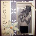
I really like this page, specifically because of the colour combo, the bold title, the bold picture that is complimented by but not overtaken by the beautiful page surrounding it, the layering (brown on outside, then pink, and then brown around the picture...and then brown with pink on only one side so that it's not symmetrical)...and just the general layout! Great work! :mrgreen: