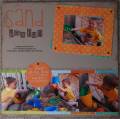
I doodled the title while looking at the doodle alphabet. The bottom right corner looks undone and plain to me, but I didn't know what else to do. Any suggestions would be helpful.
Date: Sunday, April 15, 2007 GMT Views: 432
Favorited:7
Registered: April 7, 2005 Location: stamping room with DGD Posts: 20207
Mon, Apr 16, 2007 @ 10:21 AM
great job on creating your own doodle alpha! I like how you did this sketch and the word window punches from the pp are a neat embellishment. I like the space at the bottom right - I think if you add anything else it would be too busy. JMHO
Love how you did the title! great page. I would leave that bottom corner alone-it looks good and balances the page out. I agree with Peggy. cute photos. TFS