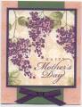
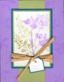
This is what I'm working on for Mother's Day cards for my stamp club. Not sure I'm 100% satisfied with it yet though. I was inspired by quite a few cards in the Blossoms Abound gallery, most notably these:
Ponygirl Gallery at Splitcoaststampers
Angela Riddell Gallery at Splitcoaststampers
tiffanywarner Gallery at Splitcoaststampers
I was originally planning to do Elegant Eggplant and Almost Amethyst, and then when I was pulling cardstock to work on this I thought that the Perfect Plum went better with Blush Blossom than Elegant Eggplant. The bow on the bottom is driving me crazy...I'll have to figure out a way to get it to turn out pretty. What do you think--should I order some ivory organdy ribbon or can I get away with pink since it's so sheer?
I stamped French Script and Print Pattern on the main panel with Blush Blossom ink, then stamped the sentiment and flowers on top. The Blush Blossom card is stamped with Linen and then the small flower from Little Pieces. Should I stick with that or should I do French Script on the background instead? And does the Mellow Moss piece need something on it as well, aside from the bow? (And does the bow need to stay or should it go?)
Yeah, I'm full of questions. Let me know what you think so I can tweak it some tonight. And I'll definitely get the main panel on there straight...how come I never notice things like that till I scan the card?
ETA: I changed out the much-hated pink organza ribbon for some satin stuff I got at M's for cheap that just so happens to be a perfect match to Perfect Plum. I went with different color schemes for my stamp club and the swap I did; this one is going to go to my husband's grandmother for Mother's Day.
Date: Thursday, March 29, 2007 GMT Views: 1860
Favorited:46
Ok, here I go!
1. You could certainly lave it just as it is, except change the ribbon.
2. If you want to stay at the same level of work as it is now, Imight leave off the tiny flowers on the first layer, and do the script over weathered, maybe? the little flowers are just a tad off in style for the hanging flowers. And the ribbon change.
3. A third change might be to punch something out of the green along the top edge, so it is a little more open. Along with suggestions of ribbon and changing the background, it is an additional step but might add a touch of elegance.
Registered: November 22, 2005 Location: Oklahoma Posts: 3569
Thu, Mar 29, 2007 @ 11:29 AM
I LOVE the print pattern background! This is such a gorgeous card.
------------------------------ Sharlene My Gallery - My Stampin' Up! Website "Let the words of my mouth, and the meditation of my heart, be acceptable in thy sight, O LORD, my strength, and my redeemer." Psalms 19:14
Registered: December 2, 2004 Location: Squinting in the glow of the neighbor's sodium-vapor security light Posts: 5577
Thu, Mar 29, 2007 @ 6:00 PM
I love the double background behind the lilacs. The only things I would change are 1.) the ribbon to a grosgrain and 2.) take the Little Pieces flower off the Blush Blossom card - it is more whimsical and the lilacs are more elegant. It is a beautiful card!
Penny
------------------------------ "Do all the good you can, in all the ways you can, to all the souls you can, in every place you can, at all the times you can, with all the zeal you can, as long as ever you can�