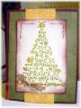
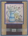
Ok, so here's my second try. (See my gallery for the first try.) Everyone said to change the ribbon, so I did...and then I had to change the color of the flowers to match the ribbon. I stuck with Blush Blossom and Mellow Moss, which is what I wanted to do so I don't mind changing colors. I tried this first with Blush Blossom for the first layer of the flowers, but that kind of faded into the background, so then I tried it with Cranberry Crisp stamped off twice and then the overlay done full strength.
Someone suggested glitter, and while I didn't think that would quite work, I did make it sparkle a little by using shimmery white cardstock instead of vanilla like I started out with. (I'm almost totally out of Whisper White, so the shimmery white option worked well!) Not sure if you can see the French Script stamped on the background of the card, and then I stamped Linen on the Mellow Moss strip. Print Pattern and French Script are stamped on the main panel in Blush Blossom.
Soooo....what do you think now?
Date: Thursday, March 29, 2007 GMT Views: 1354
Favorited:41
Good job! See! Necessity is a part of invention and creation as well!
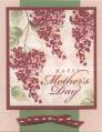
Ok, my confession- I liked the colors of the first one better; but the cranberry is almost as good! I think this weekend I will make an eggplant version myself!
Registered: February 11, 2007 Location: Pug City Posts: 14356
Thu, Mar 29, 2007 @ 9:26 PM
I think I like the violet card out of the three. The colors seem to contrast better on this card. Although, I think that all three are pretty! You can't go wrong with either of them! Nice cards!