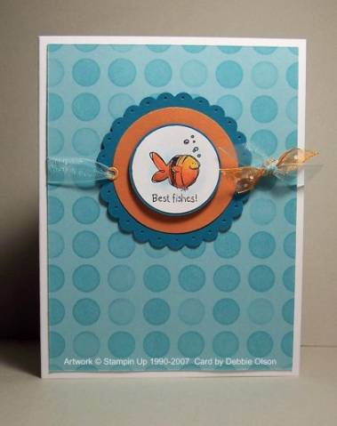
Of all of the Sell-A-Bration sets, Very Punny is the least "me" set. It's not that I don't like it; it's just that I tend to spend more time trying to give a tiny image big impact than I normally would. Having said that, I have to say that I love this little goldfish!
I wanted to use Whisper White card stock for the fish because it is such a bright white, but it isn't the best card stock for watercoloring. I experimented with my SU markers and really liked the way they looked on this image; I started with Summer Sun on the top part of the fish, switched to Only Orange for the bottom half, then added a bit of Really Rust to the very bottom to give the fish depth and dimension. To get rid of the layered look, I just used a lighter marker (like the Summer sun one) to blend colors together. That's it--how simple can you get?
Date: Saturday, February 3, 2007 GMT Views: 1777
Favorited:77
Debbie,
Adorable!! Many thanks for the coloring details. I've been trying to learn how to shade (for years now!), so I truly appreciate step-by-step instrux. Off to give this a try right now!