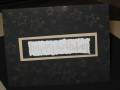
From a design that Archivers was using in one of their card classes. Think this might need some gold cord or a gold ribbon at the top...looks kinda bare. Otherwise I was trying for a truly clean, classic look. What do ya'll think? Comments and suggestions welcome. TFL
Date: Tuesday, November 28, 2006 GMT Views: 247
Favorited:4
Registered: April 23, 2006 Location: Looking For Teapots! Posts: 59742
Thu, Nov 30, 2006 @ 2:42 AM
Doesn't the scanner do weird things. I am glad you mentioned that this card is done in gold because it truly doesn't look like gold at all at least on my computer. But I can imagine it well. I agree with you I do think some ribbon would add a nice touch, maybe that really thin pretty gold cord. You could even tie a little piece around the main image underneath the square just with a little knot. Or underneath the background matt with the little bow/knot centered underneath the words. Or even three little gold brads under the words or off to the side.....I like it though....It is very classy and elegant looking and I bet even more so in real life.