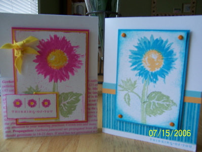
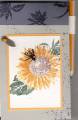
YIKES! I wanted to use this stamp set for bright Gerber Daisies. Definitely too bright. Oh well. I can't stand being stuck in a "color" just cause the stamp is a sunflower. I always love the bright flowers but maybe not for a card- I printed the definition of the gerber daisy in pink onto vellum.
Date: Saturday, July 15, 2006 GMT Views: 1996
Favorited:44
Additional Info
Stamps: Serene Sunflower, Take three, bkgd sampler
Paper: turq,, carribean, white, vellum, pos. pink
Ink: same, marigold & celery
Accessories: brads, printer, microbeads, ribbon, spray gun thingy from SU
Registered: February 13, 2006 Location: with my family Posts: 786
Sat, Jul 15, 2006 @ 4:54 PM
The bright flowers are very nice. Maybe if you wanted to tone the card downn a little, use a neutral background like sahara sand or even a dark green like always artichoke. But I love them just the way they are.... They would brighten my day if I received a card in those colors. Great job! TFS!
Registered: July 11, 2004 Location: Troy, Michigan Posts: 10374
Sat, Jul 15, 2006 @ 5:33 PM
I'm still debating about this set. At least you show it has other possibilities. Not too bright at all for me! Both are great layouts. I really like the idea of printing out the definition on vellum. TFS. Linda
------------------------------ Linda Art is the only way to run away without leaving home. -Twyla Tharp