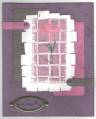
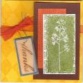
This is pretty much a case from the '05-'06 catalog, with a few changes.
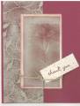
I thought the bravo burngundy was too dark, so I broke out the baroque paper and ink for part of the card. The flower is stamped in sahara sand, then burgundy is sponged over it in places. I also thought the vanilla needed sponging.
Date: Wednesday, July 5, 2006 GMT Views: 1650
Favorited:16
Registered: September 21, 2004 Location: Minglerville, Michigan Posts: 69914
Fri, Aug 24, 2007 @ 10:18 AM
Very pretty. I love how you softened the colors and the very faint BG on the main card panel! The sponging and stippling add just the right amount of depth to complement the main image!