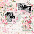
These are end of the day photos from our visit to Hampton Court. I used Rochelle Spears' August sketch again for this layout but love that it has a totally different look from my other layout. Still figuring out my Explore Air 2, but I managed to weld the title together using two different cartridges, one for the swirly letters and another for the plain.
Date: Sunday, August 19, 2018 GMT Views: 189
Favorited:4
Registered: December 4, 2004 Location: Hanging out in Scrap World Posts: 17685
Sun, Aug 19, 2018 @ 8:53 PM
Super cute! I can't wait to learn to use my Cricut Explore ... I love the look of the melded titles. This is such a cute page, it's awesome when you can use the same cute sketch more than once for different looks
------------------------------ Lela -- Scrap Blog -- Come Scrap With Us ---- YTD 87 / 300 Pages 2023 -- 64 / 252 Cards 2023
Registered: April 5, 2008 Location: Florida's Space Coast Posts: 24517
Mon, Aug 20, 2018 @ 7:31 AM
Awesome looking layout! What is the name of that font? It is perfect for this page. The b&w with the pop of red works beautifully for these photos. Love the effect of the circle frame and the bits of washi placed artfully.
------------------------------ Joyce Ann - Layouts completed: 2022/ 218; 2023/ 71. Layouts for 2024: Jan 3=72, Feb 3=75
Registered: December 17, 2006 Location: in my craft room Posts: 5587
Tue, Aug 21, 2018 @ 5:50 AM
Wonderful layout with the perfect font. Now why had I never thought to use two different fonts?? The ones that are very ornate don't always work for the whole title but you have melded them perfectly!! I also love the creativity that goes into layouts that use the same sketch with totally different ending looks!