This is a little frustrating! I made this card based on this color palette from the inspiration site, while looking at the site on my iPad...BUT when I went on my laptop to upload my card, the palette looks like different shades than it did on iPad where I matched it to my papers!
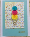
Anyways, I loved this color combination and had recently picked up a pack of chipboard die cuts from DCWV at Target on clearance -- it's a weird combo of ice cream and popsicle images, succulents and cacti, pineapples and other fruit, and flowers. I started with a small white premade card and layered on some light blue cardstock, and then a scrap of Basic Grey patterned paper. I used foam tape to attach the ice cream chipboard die cut, and added the "Life is Sweet" sticker. Super quick and easy card!
Thanks for a great inspiration site, and thanks for looking!
Date: Monday, March 5, 2018 GMT Views: 424
Favorited:2
Registered: July 9, 2008 Location: Stars Fell on Alabama Posts: 74762
Tue, Mar 06, 2018 @ 3:43 PM
Soooooo cute and colorful. Those colors do tend to change on us...a bit frustrating but your card is great and I'm betting it is really close to what you were aiming for.
------------------------------ My Blog---My Gallery---My PinterestI'm a Punchkateer! (Prez) FOREVERDirty Dozen Alumni2014 CAS Spring DT--- Inspiration Challenge Co- Hostess 12/02/17-12/28/19 Watercolor Wednesday Design Team Hebrews 13:2Brenda