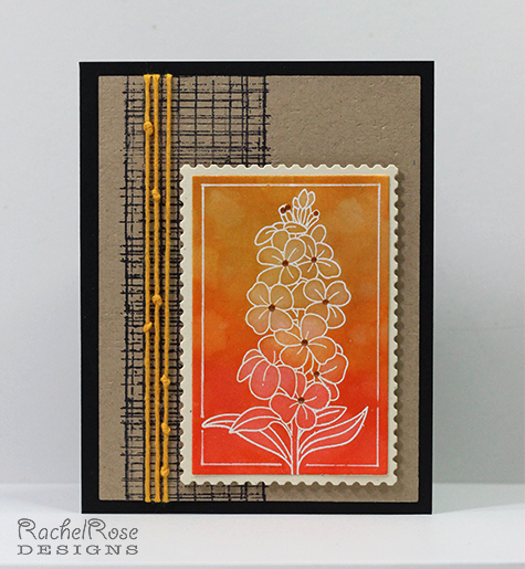
I felt like calling this "Orange and Black But Not A Halloween Card". Really, I didn't set out to use this color combo, it just happened. The focal image was made by heat embossing the floral image in white, then creating a Distress ink gradient over it. I then used my water brush to repeatedly wet and pull out the ink in the sections of the image with a paper towel. Impressed? Don't be. I saw this done in Online Card Classes' Stretch Your Stamps 2 and I even used the exact same image (they call those classes Stretch Your Stamps but for me it always ends up being a Shop For Stamps class). Go ahead and call me a CASEr, I completely deserve it. But great technique, right? And if you steal it, you don't even have to give me credit. Other than for knowing a good thing when I see it.
The rest of the card is uncharacteristically plain for me. That black strip is from a Tim Holtz set, and I did texture the Kraft piece using a PTI Linen Texture plate but it doesn't show up that well in the pic. The flower centers are Liquid Pearls in Copper. I tried really, really hard to NOT do a black card base, but this card was having none of it and I was getting tired. So black it is. Happy Halloween.
TFL!
Date: Friday, October 30, 2015 GMT Views: 614
Favorited:4
Additional Info
Stamps: Clearly Besotted, Tim Holtz
Paper: PTI True Black, Rustic Cream and Kraft, watercolor paper
Ink: Versamark, Archival Black, Distress Inks in Ripe Persimmon, Spiced Marmelade and Wild Honey
Accessories: White EP, Liquid Pearls, Nestie, twine
Splitcoast Dirty Dozen Alumni SCS Gallery Moderator Splitcoast Challenge Hostess Teapot Tuesday TEAm
Registered: July 27, 2007 Location: Dublin, Ireland Posts: 131503
Fri, Oct 30, 2015 @ 2:51 PM
The ombre effect up the flower panel is so lovely, extra-effective with the simple outlined flower image. But even more than that, I really love the knotted cord laid over the stamped mesh - that looks just so...hmm, searching for the best adjective. It's so much texture effect without being a lot of actual texture. It gives the card a very elegant finish.
Registered: August 15, 2007 Location: Twin Cities MN Posts: 50467
Fri, Oct 30, 2015 @ 4:04 PM
This is not exactly your style but I like it..and it's good to stretch! I love the border..the combo of that black burlap type design paired with the knotted twine looks so cool..very creative. And your emboss resist flower is lovely...I really like how you removed some of the color to make it less intense toward the top.
Registered: March 20, 2008 Location: Hamilton, Ontario Canada Posts: 615
Fri, Oct 30, 2015 @ 5:16 PM
I LOVE this resist effect, it is so beautiful!!! Your white die-cut frame reminds me of a beautiful postage stamp. Your knotted twine-WONDERFUL, I agree that it is very elegant especially over that grid-work. WOW, this is going into my favorites. You've wildly impressed me, I love it!!!