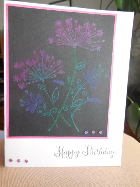
Well! Here's my try at the chalkboard technique. Even though I used vibrant chalks, they ended up being very soft in colour....hard to photograph. I had some pink gems, but they were not the right shade, so I coloured them with blue and purple copics, to match a little closer.
Date: Thursday, February 27, 2014 GMT Views: 1299
Favorited:2
Registered: April 5, 2011 Location: Kelowna, B.C. Canada Posts: 3567
Thu, Feb 27, 2014 @ 1:35 PM
Thanks for taking the challenge and I like your card.. I know the colors are always very muted. I have that stamp as well and tried it with the chalks.. It is hard to see the color. a more solid stamp or shape is easier to color... Just took another look and I like it, looks like it is sitting in a mist.....