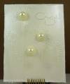
Jen has asked us to do a card based on our favourite tv shows for this challenge. I'm a sucker for all things "wedding" - Four Weddings, Rich Bride/Poor Bride, Say Yes to the Dress, etc. So a wedding card it is.
I dry embossed the ivory cardstock then dragged some Frost White paint from the top to the bottom of the card. It gives it sort of a strie #sorry don't know how to put the accent over the "e"# look. Next I stamped the sentiment in Crumb Cake.
The three embellies are layered retired SU buttons and pearls from the retired Pretties kit. The only other thing I did was some distressing to add a little interest to the edges.
Thanks for checking out my card and thank you for your kind comments! Good luck to the other semi-finalists. I'm looking so forward to seeing your designs!
Date: Friday, August 26, 2011 GMT Views: 2151
Favorited:6
Splitcoast Dirty Dozen Alumni Creative Crew SU Design Team Alumni
Registered: October 29, 2004 Location: Coos Bay, Oregon Posts: 24007
Fri, Aug 26, 2011 @ 8:23 AM
Lee-Anne, your wedding card is so gorgeous and yet CAS. I LOVE the EB background, Frost White Paint, pretty button and pearl embellishments, sentiment and distressed edges. All so creative. TFS
P.S. my card is done, but not enough light yet for a good photo. Don't we have fun?!?
Registered: September 7, 2005 Location: The 5280! Posts: 10329
Fri, Aug 26, 2011 @ 12:32 PM
Very pretty!! tfs!!
------------------------------ Tenia Nelson Thanks for the lovely comments!!
My Blog:Jazzy Paper Designs Summer 2012 CAS DT Member
Currently designing for some great companies!!!
Registered: February 21, 2009 Location: Mt. Pulaski, IL Posts: 29131
Fri, Aug 26, 2011 @ 4:45 PM
Oh, Lee-Ane, I love the look of this card - it turned out wonderful. It has a bit of a lovely pearl finish to it. Beautiful embellishments - and just perfect. Good luck!!
------------------------------ Kathy - 101 Airborne - My Gallery and My Blog
Splitcoast Dirty Dozen Creative Crew SU Design Team Alumni Splitcoast Challenge Hostess
Registered: November 28, 2004 Location: St. Paul, Minnesota Posts: 11206
Sat, Aug 27, 2011 @ 8:55 PM
What a splendid card. Your choice of ink is perfect here. It't just dark enough to clearly be seen but it doesn't overwhelm the white on white feel of the card.