Betty gave us these colors for today's challenge: Dusty Durango, Bermuda Bay, Crushed Curry, with neutrals of choice. I used substitute colors.
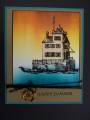
These colors reminded me of sunsets on the Lake Erie where I grew up. Truth be told, I don't think we had "turquoise waters" at sunset or any other time! : ) This is an image of the lighthouse that is still in my hometown.... it is a special stamp for me. One wall of the lighthouse does have a wash of white acrylic paint.
TFL
Date: Tuesday, June 29, 2010 GMT Views: 765
Favorited:10
Registered: June 9, 2006 Location: Wauconda, IL Posts: 55667
Tue, Jun 29, 2010 @ 5:32 AM
There she goes again, is what I said to myself. Beautiful Sallie!! I was hoping someone would brayer these colors together like that. YOur light house looks gorgeous surrounded by those pretty colors. I like the way the blue comes up around the edges of your light house. Nicely done!!
Registered: April 9, 2007 Location: Parker, CO Posts: 1392
Tue, Jun 29, 2010 @ 6:19 AM
There is SO much about this card that I love. Your sunset is gorgeous. And I had to really study the lighthouse to figure out how you did it -but the wash of white maintains some of the color of the sunset underneath - so the lighthouse appears beautifully bathed in the skies' colors. Just gorgeous!!