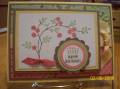
I think these colors look stunning together. What do you think?
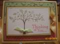
For my tree image I inked my stamp first with Versamark then with Choc. Chip and then used clear embossing powder to get a Choc Chip tree.
I bunched up the ribbon behind the corduroy brad prongs and then stuck the brad through the RR piece. I adhered each side of the ribbon down, after giving it a bit of a ripple on either side of the brad.
TFL
Date: Sunday, August 2, 2009 GMT Views: 2165
Favorited:59
Registered: April 3, 2007 Location: In a state of oblivion.... Posts: 14120
Sun, Aug 02, 2009 @ 7:58 PM
Wonderful colour choices! So missing Parisian Breeze papers - don't see anything that comes close in the new catty... Great card...
------------------------------ Heather ...... My Gallery You cannot do a kindness too soon, for you never know how soon it will be too late." Ralph Waldo Emerson Founding Member of the Punchkateerz - "You don't have to be crazy to be one of us, but it sure helps."
Registered: November 18, 2004 Location: Ohio Posts: 4981
Fri, Aug 07, 2009 @ 6:58 AM
YOu're right, they do look stunning together. For that matter Razzleberry looks good with so many colors- heck so do kraft and chocolate... no wonder this is such a great combo. Love your design too- with the corduroy button and ribbon treatment, plus using the tree on that paper is amazing! Way to go!