Splitcoaststampers.com - the world's #1 papercrafting community
You're currently viewing Splitcoaststampers as a GUEST. We pride ourselves on being great hosts, but guests have limited access to some of our incredible artwork, our lively forums and other super cool features of the site! You can join our incredible papercrafting community at NO COST. So what are you waiting for?
I did the very same thing! I cut out a little box so that I could go to the back button. I had to get rid of that left margin because it was giving me a huge headache. I have never been to a site before that actually made me feel ill! If they keep it this way I will have to stop getting on SCS. It's a bummer because it's a great site, but not at the expense of not feeling well.
That is exactly what I was trying to say - but couldn't quite figure out how to word it. Thanks for reading my mind! ;)
__________________ "You may not have lost all your marbles, but there's definitely a hole in the bag." Grumpy Cat
I can get used to the new format and it doesn't particularly bother me (though I like the old format better). I am having gallery issues, though, and can't find the recent uploads. (I am on IE, too, like some of the others having issues with the gallery.) That said, I am not a fan of the share on facebook feature. If I want to share it on my facebook account, I will do that and don't really care for the idea that it is so easy for someone else to share my card there. Even though they could just save it and upload it, it just seems easier with the facebook thing being right there and if I had the choice, I would opt out of that showing up on my uploads as well.
Change is supposed to be good. I don't like the new format at all. I don't like the search error I got, or the new look in the forum, definitely don't like that the gallery is different and haven't been able to view any work.
PUH-LEEZ go back to the way it was. I feel like I've lost a friend. The site was great before the changes. I probably won't spend as much time here as I used to because the functionality isn't here any more.
I'm also sad also because my favorite day is "Favorites" day (Sunday), and it won't be as enjoyable as it used to be.
Let me say up front that I know zip about website design, but I was wondering if there is any chance the posts could re-flow back to the left after what's posted in the left hand column is "done"? Probably not, but I thought I'd say it.
I am trying to find the "onsie" cards and now I can't search for them to get the template!!!! UGH! Boy, I that was a great feature, I sure hope they bring it back!!!
I use it all the time for searches...from flowers, to masculine, to onsies!!!! Help! Now what do I do!?!?!?!?!
Also, I don't care for the info on the left...but my main issue is that there is not a place for searching any more....big bummer.....
If that old feature was back, I could put Big Shot in the search box, then pull up all cards that used DPS, or all cards that used a certain punch, ...or a specific color I had in mind!!
It made designing a card soooo easy!!!
I LOVED that feature!! Please, Please...bring it back!!
I hate to say this, but I am seriously considering letting my paid membership lapse. I love this site, but it's no longer user friendly and I just don't have the time to try to figure stuff out when it doesn't work.
One change I did appreciate was the heart to favorites link - that's great.
Quote:
Originally Posted by sassyat30
Daven, I'm asking you straight up ~ is there any possibility the format will go back to the way it used to be?
If there is no way it will be go back to the old format, I won't be spending much time here, and I've heard many others say the same thing.
It literally isn't worth the headache it gives me, nor to be bombarded with more ads. I know Name Media's main purpose is to sell ads on webpages, but that isn't what we want on SCS.
I know I'm not alone in feeling the new format doesn't function, isn't balanced and seems to be causing all kinds of problems in the viewing of the gallery.
I'm no longer a paid member (I let my membership lapse once Name Media took over) but I think that many people here have valid concerns that haven't been addressed yet.
__________________ The Lord is a refuge for the oppressed, a stronghold in times of trouble. Those who know Your name will trust in You, for You, Lord, have never forsaken those who seek You. Psalms 9:9-10
Hi - just stopping in to ask if someone can tell me HOW to find the gallery...not just SU, not just Member Gallery, not just manufacturer's gallery, just the last seven days of uploads????
I don't like the new format very much. I find the left column distracting to say the least. I don't like the squished to the right look, it's much more difficult to read the forums (and gives me a headache), andmakes the pictures of cards/projects in the gallery much smaller when viewing. I actually taped a sheet of paper over the left side of my screen because that left column bothers me so much. However, it gets in the way when I need to use other sites or just my regular computer programs.
I have seen a couple people in this thread mention concerns about facebook, but I haven't seen anyone answer these concerns (at least not here). I have purposely avoided using facebook up to this point and I don't intend to change that, so I admit I'm not very conversant with how facebook works. Will it be possible for stuff from the gallery to be viewable/posted on facebook?
I've made SCS a part of my day & made some good friends here, but if this new format becomes permanent I'm sorry to say that I'll be spending a lot less time here.
DITTO! Is this a community for stampers or a community for ads?
Christine already mentioned one concern - at the bottom of the page, the current forum used to be listed, and of course it was easier to click that if you wanted to look at more threads - but of course you can use the list with the arrow now.
EXCEPT
If you want to open that link in a NEW TAB and keep the thread open that you are on - well, the arrow version does NOT allow that. No right clicking.
Me very sad. :(
YAY!!! You put it back!!!!!!!!
THANK YOU!!!
Me very happy!
__________________ Kathy Wrose "Fun must be always." - Tomas Hertl, San Jose Sharks "It was fun." - Kirk, Star Trek: Generations
oh- Good!!! Can you tell me what you used it for?!?
I could NEVER figure out the purpose of it!!!!
I know who my friends are, and can easily find them at any time, and have in the 4 years of being on here NEVER understood that service!!!:-D
I use it to keep up with my buddies! Also, if you are sending out a PM to many people at once, for a swap or something, all you have to do is open your buddy list, put a check mark beside the people you want included in the PM, and then type your message! I like being able to open my buddy list when I first get to SCS and see who all is on. :-D
Are we going back to the old format? I havent heard a response on everyone asking if you guys are...Looks like the majority of people here like the old format better....I am hoping we go back to it also....Thanks
Are we going back to the old format? I havent heard a response on everyone asking if you guys are...Looks like the majority of people here like the old format better....I am hoping we go back to it also....Thanks
This is Daven's response from yesterday in another thread...
Quote:
Originally Posted by splitcoaststampers
we won't likely be making the left column optional, no. our intention there is to bring consistency and simplicity to the navigation and viewing of the site. rather than eliminating the left column we'll continue tweaking until we get it right.
I'm getting different views on different pages, ATM. For example, this one is OK but the "Stamping stuff" top level page has a horizontal scroll bar at the bottom and the header is not the same width as the rest, there's dead space on the right of it.
Screen shot attached, I'm using Firefox and monitor is set to 1280x800
I'm still seeing the same issue as Joanne's screen shot in reply #66 in this thread. Mine is on some Gallery pages, in Firefox 3.0.7 with screen resolution 1280 x 1024.
Quote:
Originally Posted by kthaman
On the Control Panel page, the banner is out of the box
For the My Subscriptions page, my Firefox is also matching Karen's "out of the box" screen shot in reply #122. In Firefox, the rest of the Control Panel pages are at the left edge of the screen rather than centered.
You were working on IE7 issues earlier, but I'm not sure of the status for Firefox on your fix-it list. I'll be happy to upload more screen shots if you need them.
I do appreciate all that you and the team all do for this site. However, you have said you do want our input so here is mine again (I posted when the changes first went into effect).
I've given myself awhile to adjust and I still do not like the new format. If we are stuck with the navigation panel on the left, is there any way to make it in a smaller font?
My main issue is that I now have to scroll down a lot more often. That doesn't sound like a big deal, but it is a big difference in navigation. Extra scrolling aggravates my carpal tunnel which makes it harder to make cards!
Also, the gallery photos are a lot smaller and also require a lot more scrolling.
I work in information technologies and understand the need to standardize navigation. However, the addition of the side menus has made navigation harder for me in the function I do the most which is why I do not see it as an improvement. I have done that in the past myself - designed some screens that I thought looked great. Then with input from my end users, I realized it didn't work well for the people that really used the system 24/7 and had to change it.
Thanks again for wanting to keep this site fresh and useful. I just hope you are open to input from us!
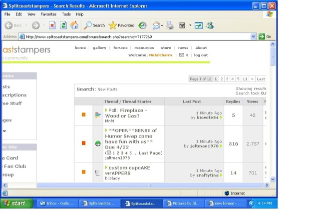
I know you guys are still working out kinks, but just in case you haven't seen this one, here is what the results of the "Find all posts by this user" search looks like...
It has been a couple of weeks now, and I hate to say it, but I still do not like the new format.
Can it please be changed back?!
As I said in an earlier post ... change is good, but not this one.
I agree I have not found one thing about the changes I like. I guess I'm lucky that I don't have to deal with the whole page not being on my computer screen, I know that would send me over the edge. I haven't read much more about that so I guess that's been fixed.
If I could change things on the site I would have all the links at the top right of the screen with drop down menu choices. I do not like the links on the left and all the space that is below. Just waiting on advertising to fill up the space. I also don't like the way the links are grouped, it makes no sense to me. If I have to deal with it I would rather have the links make sense the way they are grouped, the list below at least makes sense to me.
In the Forums: New Posts Stamping Forums Member Companies Challenges Swaps Sell Some Stuff
Search: ( with a drop down box )
All About Me: My Subscriptions ( This would be for Subscribed Threads only, NOT to find my control panel ) My Buddy List ( the way it was before!!!) My Private Messages (I don't want to have to go to my control panel to get my messages) My Gallery ( I can go there to upload a card) My Control Panel ( have this open up in a new window)
Quick Links: Reader feed Back Member List Contact Us Fan Club Get the News Letter
Get Social: Join a User Group Support Our Troops Join Our Facebook Group Become a Facebook Fan Splitcoast On Twitter
There are links at the top right of the page, links above the banner ad and links on the left. It all looks messy and disorganized. The links above the banner ad look lost and I hardly even see them. Stamping Stuff, Member Companies, Other Stuff, I really don't see why these links are necessary at all, but if you want them why not add them to the left with the other links.
Same thing in the Gallery. Links everywhere, many have nothing to do with the Gallery. The links above the banner ad seem once again, lost.
If the links have to stay on the left why not organize them in a way that makes sense, and remove the links from above the banner ad.
In The Gallery: Gallery Home Page Recent Uploads ( in a drop down box, last day, 7 days, 14 days, all) Company Galleries Stampin Up Galleries Member Galleries
Search: ( With a drop down box )
My Gallery: My Albums My Favorites Up Load a Card My Card Profile
Other Galleries: Fan Club Dirty Dozen Fan Club Interactive Technique Spotlight Anything But a Card Scrapbooking Pages User Groups Special Collections
Well that's a few of my thoughts on the new design of Splitcoast, I'd love to hear what you all think.
Friends are like the walls of a house. Sometimes they hold you up, sometimes you lean on them. But sometimes, it's enough to know they're just standing by.
Barb, those are great suggestions! Thanks so much for taking the time to get everything organized! I emailed Daven so he can check your post. Good stuff!
Bev,
Are you still experiencing view problems on your end? Contact me privately, and we'll see what we can figure out.
When my SCS membership subscription expires, I will NOT RENEW!!!
That's what I think!
Will you renew your subscription? That was the very thing being discussed with my buds yesterday that prompted my earlier post.
Personally I became a member every year not because of instant uploads and the Fan Club Gallery. I payed my money to help support a site that I spent so much time on. I thought it was a small price to pay for a site where I had so much fun and got so much enjoyment out of. I have met some wonderful friends here and love chatting with them in the forums. I love looking at the cards in the gallery and leaving comments on some of the wonderful artwork.
I now see the advertising in the resources and news areas of Splitcoast, should I assume this is the type of advertising that will be added to the left column in the Forums and Gallery? Will we have to deal with moving, flashing advertising in the banner ads as well as in the left column? If this is the case I will probably drop my membership as well.
Splitcoast will no longer be the site it was, it's visually calming design is gone. The current design and added advertising makes me feel tense. I can hardly look at the home page any more, over the last few years it has become a visual nightmare! I am one of those people who like things balanced visually. Splitcoast no longer has that look to it. Having the links scattered all over the screen is also unnerving to me. I'm sure I will continue to visit Splitcoast, but I will not be spending near as much time here. I doubt I will join the Fan Club in the future, I won't feel the need to help support the site like I did. If the site continues to grow it's Member Companies and advertising, I'm sure my donation won't be missed anyway.
I do appreciate all that work that is done on this site, I'm sure it's not easy. You will do what ever you need to to keep it up and running and make and make a profit, and I will learn to deal with what ever changes you make, that doesn't mean I will learn to love them.
Friends are like the walls of a house. Sometimes they hold you up, sometimes you lean on them. But sometimes, it's enough to know they're just standing by.
Thanks for sharing your feelings with us (and your fabulous suggestions earlier!), Barb. We really appreciate it, and we do listen! I also want to thank you for supporting the site with your Fan Club subscription. Yes, we do have Member Companies and an advertising program. All three of these are sources of revenue, and all three are important to us!
I'll check with Daven, but I think we've had advertising on the news and resources pages for some time, at least as long as I've been working on the tutorials (about 3 1/2 years). You mentioned the possibility of moving and flashing ads in the left column. I don't know that we'll see anything animated over there . . . we don't allow blinky avatars or signatures because they're distracting, and we don't like to have moving and flashing ads, either. If ever you see an ad that's doing either (or making noise or taking over your screen! yikes!), please get the url and let us know by posting a new thread in Site Suggestions or emailing [email protected]. We'll get the ad blocked. We like to enjoy the forums and gallery here, too!
So I don't mind the "new format", the ads don't bother me, and the "left column" everyone is complaining about is really not a big deal.
BUT WHY IS THE GALLERY TOTALLLY WONKY today?? When I click the "gallery" button at the top, the different gallery options are all to the left side, only one at a time and I don't see the "my gallery, my favorites, my albums, and the search" ooptions?? It was fine earlier this morning?? How do I get to "my gallery"????
__________________ We cannot do great things, only small things with great love.
Oh good! I just came on the site -and oh... I was scared! I saw the very same thing as Shirley above! Now I know it's not just me! Thanks so much for your help Jenn! and Mark!
What happened to the little heart symbol to make a card a favorite? Wasn't that one of the new features? Is it gone, or am I just losing my mind (and my vision)? haha
they're working on restoring the main gallery page. . . I see the gallery as it's supposed to be (hearts, too!) when I click on a My Gallery link, though.
they're working on restoring the main gallery page. . . I see the gallery as it's supposed to be (hearts, too!) when I click on a My Gallery link, though.