Splitcoaststampers.com - the world's #1 papercrafting community
You're currently viewing Splitcoaststampers as a GUEST. We pride ourselves on being great hosts, but guests have limited access to some of our incredible artwork, our lively forums and other super cool features of the site! You can join our incredible papercrafting community at NO COST. So what are you waiting for?
OK, so I'm new to Spectrum Noir pencils, but created this today. I was wondering what advice people could give me, I'm struggling with possible layouts. I was thinking of adding gems to one corner, or maybe using a template I own to cut the girl into a fancy shape, I am just really not sure how to proceed now.
This was one of my problems with the gold too, to be honest, I want to use it, but it's just so MUCH sometimes. I'll give that idea a go, see how it looks.
__________________
~*~Diana~*~
Breila - Welsh for Dusky Rose
Pagan, crafter, slightly daft
Another thing you might try with the little girl card is to overlap the sentiment on the bottom of the image layer; or move the ribbon to the right so it's under both the other elements. I like to see cards with all of the elements connected somehow. I would suggest playing with layers of mats like RiverIsis suggested, and then with the placement of the three major elements.
__________________ SilverSnow Lois Malachi 3:10 "See if I will not throw open the floodgates of heavenand pour out so much blessing that you will not have room enough for it"
I just made this card and I hate it. I do like the main focus, but the bits and pieces behind it look like I just threw some scraps up and just left what stuck there. I added stuff just to add it, I guess. Help!
I just made this card and I hate it. I do like the main focus, but the bits and pieces behind it look like I just threw some scraps up and just left what stuck there. I added stuff just to add it, I guess. Help!
Hi Jessica,
I really love the gold star you made! It really shines! To highlight it I would
1. create 3 or 4 more pretty stars, trim & and tuck them in and around your white panel.
2. pierce a border around the white panel with a paper pricker.
Hope this is helpful.
Jessica, the sentiment and star looks amazing. I agree with you and love the white space. I do think Cindy's suggestion of a couple of smaller stars is right on target, especially since the star in the sentiment is plural. I'd suggest just two or three small stars. Great design, I love it!!!
So much better! Although I think the major focus star a little askew would be perfect. Like you're really reaching for it. Just my 2 cents! Love the colors.
Good morning! I am having an issue with colouring stamped images. Not sure if someone could offer any suggestions. I have very slowly been starting a Copic Marker collection (really slowly...I currently have less then 10 markers). My issue is that when I stamp images using SU! Classic Basic Black, even if I wait until it dries, as soon as I start colouring with my Copics the black bleeds into the colour. Is there a special ink I should be using to stamp my images? Do I need to heat emboss prior to colouring? Any suggestions would be greatly appreciated...it's so fun to colour with my new markers and this is quite discouraging.
Good morning! I am having an issue with colouring stamped images. Not sure if someone could offer any suggestions. I have very slowly been starting a Copic Marker collection (really slowly...I currently have less then 10 markers). My issue is that when I stamp images using SU! Classic Basic Black, even if I wait until it dries, as soon as I start colouring with my Copics the black bleeds into the colour. Is there a special ink I should be using to stamp my images? Do I need to heat emboss prior to colouring? Any suggestions would be greatly appreciated...it's so fun to colour with my new markers and this is quite discouraging.
You can emboss the Basic Black with clear embossing powder, because it will bleed without embossing. Memento inks are compatible with alcohol markers, but SU ink is not. Hope this helps.
Good morning! I am having an issue with colouring stamped images. Not sure if someone could offer any suggestions. I have very slowly been starting a Copic Marker collection (really slowly...I currently have less then 10 markers). My issue is that when I stamp images using SU! Classic Basic Black, even if I wait until it dries, as soon as I start colouring with my Copics the black bleeds into the colour. Is there a special ink I should be using to stamp my images? Do I need to heat emboss prior to colouring? Any suggestions would be greatly appreciated...it's so fun to colour with my new markers and this is quite discouraging.
Memento Tuxedo Black, and all the Memento inks are recommended for copic markers. I love my copics, they're just the best!
I agree...I'm having fun with the few Copics I have. I am just waiting for my next Michael's 40% coupon, and I will head over to purchase a Memento ink. It's more work, but I can emboss if I really feel the need to craft/colour. Thanks!
I agree...I'm having fun with the few Copics I have. I am just waiting for my next Michael's 40% coupon, and I will head over to purchase a Memento ink. It's more work, but I can emboss if I really feel the need to craft/colour. Thanks!
It's not recommended to use embossing powder with copics; it can ruin the tips of the markers (and, I think, in some cases the alcohol ink dissolves the embossed powder).
I am totally new to alcohol markers and though I researched and bought the proper paper, I totally forgot to add layers of copy paper under and ended up with a mess last night...sheesh who would've thunk coloring could be so technical. I am tossing that out there since I know you are already frustrated. Hoping to save you some more! These pens really are fantastic, exactly the vibrance I was after. Good luck!
__________________ "You can never have too much stuff, however, the best things in life aren't things is also true" - www.stuffnthingz.com
Got my Memento Tuxedo Black Ink...and it works splendidly! Absolutely no smudging, just a nice crisp image that is beautiful with Copics. Thank you!
I'm so dumb, I still haven't bought any Memento Tuxedo Black, and yet I keep trying to color with Copics, and I get so discouraged when it starts bleeding. Well not dumb so much as broke. I meant to get some at Michaels when it was 50% off last week, but I was so busy I didn't get around to it.
My sister just gave me a couple dozen of her Copics, and I really want to use them on birthday cards I need this week! I may have to cash in some empty bottles and buy it at full price, lol. :lol:
Could you cut out and remove one of the geometric shapes to allow for space underneath to stamp a sentiment? That's what I would do as adding a sentiment on top of it would seem to distract from the gorgeous sheen of that metallic sheet.
I would print out a sentiment like "you are riveting" or some other reference to the riveted panels. Then die cut it out in a shape that echoes the panels in the back. Place on the front with foam tape.
It is such a great back ground that a one line sentiment on the front in your favorite shape is all it needs. Great card for a man or teen.
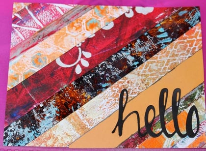
I love the gelli plate, and abstract paintings and collages. I put together several card bases from left overs I had. These strips are taped to a white background and can be cut down or die cut again. Right now they are the exact size of my card base.
I like this strong background, but I do not know what to put on top of them other than a black/white sentiment. I can die cut flowers in these colors (did that and it didn't say anything to me).
Hi Janet - first off, great background! I think that because it is such a bold graphic background, you are going to be limited because you don't want to compete with the background. Although personally I don't think more is necessarily needed, if you wanted you could try: ribbon (smallish width, in parallel to "hello" sentiment) or twine, bling (a few sequins, rhinesstones, enamel dots) on the yellowish stripe or scattered). Just a few thoughts.
Hi Janet - first off, great background! I think that because it is such a bold graphic background, you are going to be limited because you don't want to compete with the background. Although personally I don't think more is necessarily needed, if you wanted you could try: ribbon (smallish width, in parallel to "hello" sentiment) or twine, bling (a few sequins, rhinesstones, enamel dots) on the yellowish stripe or scattered). Just a few thoughts.
Thank you for the suggestions. I thought they were all good. I used twine and some melted pony beads in the colors of the strips. I tried so hard to put those orange and teal flowers on there some how, but it got louder than it already is.
Pictures are amazing - I see I need to re-ink the bottom of the card...
Thanks again for your help. When I didn't hear from anyone I thought I won the "Wow, We Are Speechless" award. Given to the world's ugliest card - and must be unanimously voted on to take home this coveted prize. LOL We do have one of those right? ;)
Well, those DIY enamel dots certainly look great. The twine does, too. I did look at the post, but because I got the impression you wanted to use the whole panel as it stands, I didn't have any constructive ideas to offer. My personal approach would have been to cut the print into strips or squares and mat them.
Thank you for the suggestions. I thought they were all good. I used twine and some melted pony beads in the colors of the strips. I tried so hard to put those orange and teal flowers on there some how, but it got louder than it already is.
Pictures are amazing - I see I need to re-ink the bottom of the card...
Thanks again for your help. When I didn't hear from anyone I thought I won the "Wow, We Are Speechless" award. Given to the world's ugliest card - and must be unanimously voted on to take home this coveted prize. LOL We do have one of those right? ;)
Hi Janet, I'm sorry I'm late to the party! I love the embellishments you added to your card. As you love gelli plate results & will no doubt use more (as well you should, they look awesome), so here's a few more ideas...
- mat the whole panel with a bold color like black, helps your panel really pop.
- layer several die cut words on top of each other to create more depth, and distinguish from the bold background.
- follow your lines i.e.: layer your word die diagonally along the plainer orange panel to help the word pop.
- I also like the above idea to separate each panel slightly.
I hope these few suggestions are a help for future cards.
Happy stamping!
Well, those DIY enamel dots certainly look great. The twine does, too. I did look at the post, but because I got the impression you wanted to use the whole panel as it stands, I didn't have any constructive ideas to offer. My personal approach would have been to cut the print into strips or squares and mat them.
This is a great idea. I could cut them into 4 squares, mount them on black CS, then arrange them on the card base. Or put just 2 of the squares on, which would tone down the color explosion. Thanks for that idea.
I wish I was better at photography. The colors on these panels are rich and vibrant. My pics do not show their true colors.
Hi Janet, I'm sorry I'm late to the party! I love the embellishments you added to your card. As you love gelli plate results & will no doubt use more (as well you should, they look awesome), so here's a few more ideas...
- mat the whole panel with a bold color like black, helps your panel really pop.
- layer several die cut words on top of each other to create more depth, and distinguish from the bold background.
- follow your lines i.e.: layer your word die diagonally along the plainer orange panel to help the word pop.
- I also like the above idea to separate each panel slightly.
I hope these few suggestions are a help for future cards.
Happy stamping!
All great ideas. Fortunately I have 6 more of these cards in various color themes so I can play with all these ideas and create much better looking cards.
Beauty truly is in the eye of the beholder. We are all so diverse in tastes. What a great community.
Thanks everyone.
Last edited by Janet1000; 07-09-2015 at 06:28 AM..
I agree with Lynn about moving the rooster panel up, though I think I'd leave the button and twine where they are. To my eye, moving just the panel would break up that straight line along the top of the banner strips and image panel, and make a more interesting layout. But I love your soft muted colours, gorgeous.