Audrie gave us this amazing color site called https://designschool.canva.com/blog/...-combinations/
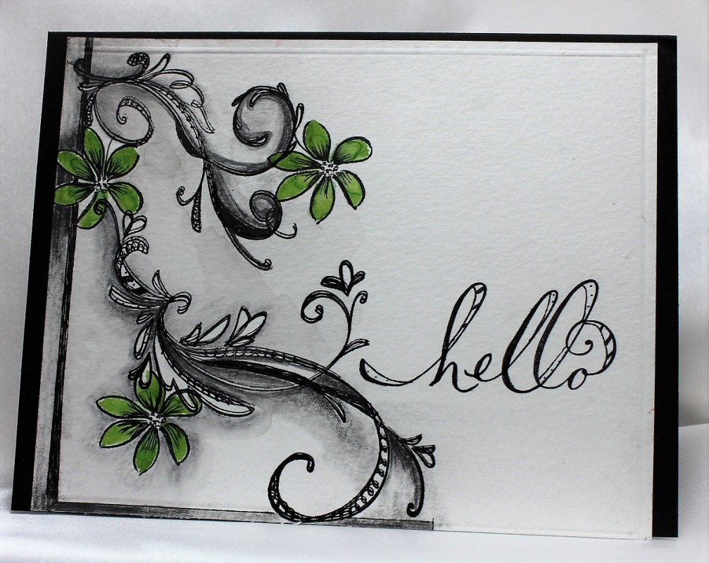
The color palettes were all inspiring, and very informative why they are eye appealing. I chose #92, because of the contrast of colors. Taking some very old flourish stamps and a single small flower stamped a design to look like the trendy zentangle. This is were the fun began....love to doodle...took a micron pen and added doodling to the flourishes. Then with the sketch pencils added the extra shading. Sketching with pencil is very forgiving with a good eraser. Some of these pencils are water coloring. Went over it all with a wet brush. Colored the flowers with the green for a pop of color. Stamped the sentiment, and did a little doodling. TFL
Date: Saturday, February 13, 2016 GMT Views: 1304
Favorited:11