Audrie gave us this amazing color site called https://designschool.canva.com/blog/...-combinations/
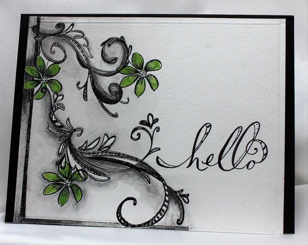
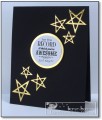
The color palettes were all inspiring, and very informative why they are eye appealing. I chose #92, because of the contrast of colors. Taking some very old flourish stamps and a single small flower stamped a design to look like the trendy zentangle. This is were the fun began....love to doodle...took a micron pen and added doodling to the flourishes. Then with the sketch pencils added the extra shading. Sketching with pencil is very forgiving with a good eraser. Some of these pencils are water coloring. Went over it all with a wet brush. Colored the flowers with the green for a pop of color. Stamped the sentiment, and did a little doodling. TFL
Date: Saturday, February 13, 2016 GMT Views: 1306
Favorited:11
Registered: July 9, 2008 Location: Stars Fell on Alabama Posts: 74776
Sun, Feb 14, 2016 @ 9:21 AM
Awesome doodling and a beautiful card.
------------------------------ My Blog---My Gallery---My PinterestI'm a Punchkateer! (Prez) FOREVERDirty Dozen Alumni2014 CAS Spring DT--- Inspiration Challenge Co- Hostess 12/02/17-12/28/19 Watercolor Wednesday Design Team Hebrews 13:2Brenda
Registered: June 4, 2009 Location: Deatsville, Alabama Posts: 82526
Tue, Feb 16, 2016 @ 3:22 AM
The shading is amazing and the pop of green against all the black and gray and white is amazing. Beautiful work! Hugz
------------------------------ Nancy Williams - Hope your day is Spirit-filled and ink-filled (in that order)!DRS Designs-DT, Punchkateerforever, Dirty Dozen Alumni
Registered: April 6, 2010 Location: Union Grove, Wisconsin Posts: 1107
Tue, Feb 16, 2016 @ 10:37 AM
very cool. I love how simple and intricate this is all at the same time. Splendid use of the space on your card. The green is just the right amount of color pop. Beautifully executed.