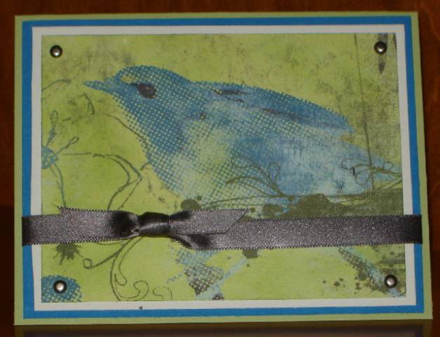
This is my submission for today's Color Challenge - to use Pacific Point (Not Quite Navy), Basic Gray and Certainly Celery for our card. I am not a big fan of Pacific Point, but I decided to try and get it in there. I may have to go back and do one with Not Quite Navy which I do love.
This is also for Beate's Inspiration Challenge which this week was to be inspired by the colors or patterns of the child's mobile shown here: Blogs at Splitcoaststampers
The colors in the inspiration photo were a great match to today's challenge colors. I also incorporated a bird, although not a whimsical bird like the mobile.
I took the easy way out and let the Basic Grey Periphery DP take center stage. I'm afraid there's no stamping except the sentiment on the inside. I sponged the DP with Celery to deepen the color and added some antique silver brads and some gray satin ribbon for interest.
Thanks, Christine, for stepping in with a great color combo and Beate, for another fun Inspiration Challenge!
Date: Tuesday, November 11, 2008 GMT Views: 891
Favorited:2
Registered: November 7, 2006 Location: Willamette Valley Oregon Posts: 34503
Thu, Nov 13, 2008 @ 10:14 AM
don't know how I missed this one Carla! FANtastic! love those papers and this was perfect for the challenge, I love how you placed the ribbon and even though I agree with you on the Pacific Point (I even gave away my stash of that color on Monday to my neighbor...kept a sheet and 1/2), it is a great hue for that Basic Grey. anyway, I've gone on tooo long...I LOVE THIS ONE!
------------------------------ Susan~~~One4Joydaily I'm a FAN CLUB member, U? MY GALLERYof visual Delights MY BLOG