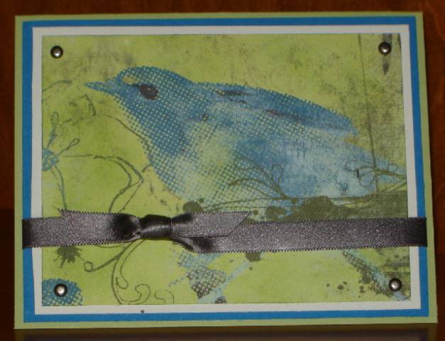
This is my submission for today's Color Challenge - to use Pacific Point (Not Quite Navy), Basic Gray and Certainly Celery for our card. I am not a big fan of Pacific Point, but I decided to try and get it in there. I may have to go back and do one with Not Quite Navy which I do love.
This is also for Beate's Inspiration Challenge which this week was to be inspired by the colors or patterns of the child's mobile shown here: Blogs at Splitcoaststampers
The colors in the inspiration photo were a great match to today's challenge colors. I also incorporated a bird, although not a whimsical bird like the mobile.
I took the easy way out and let the Basic Grey Periphery DP take center stage. I'm afraid there's no stamping except the sentiment on the inside. I sponged the DP with Celery to deepen the color and added some antique silver brads and some gray satin ribbon for interest.
Thanks, Christine, for stepping in with a great color combo and Beate, for another fun Inspiration Challenge!
Date: Tuesday, November 11, 2008 GMT Views: 888
Favorited:2
Registered: May 31, 2008 Location: Seattle Posts: 14509
Tue, Nov 11, 2008 @ 8:46 AM
Beautimous! tfs
------------------------------ SCS Fan Club Member
Thrilled to have been Featured Stamper #132
Thrilled to be a Puchkateer! Musezi
Thrilled to have been Queen for the Day #166
Thanks SCSers for all your encouragement!
Registered: April 6, 2005 Location: Stuarts Draft, Virginia Posts: 14401
Tue, Nov 11, 2008 @ 9:11 AM
This is so beautiful (you had me fooled as I thought the bird was a stamp at first)!! I, too, have shied away from using PP but this challenge was great to 'force my hand'. Love how your pewter brads echo the gray ribbon!
------------------------------
Wanda Cullen ~ Dirty Dozen Alumni, On design team for Papertrey Ink, Designer for Color Throwdown and Fusion Card Challenges Cullen-ary Creations[/URL]...my blogHERE'S MY GALLERY[/URL]