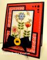
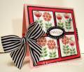
This is a really pretty color combo, except for the bravo burgandy. LOL. Okay, so I hate that color. I don't mind the cardstock, but the ink....oh my....it's so....bravo brown or something. So I only used the cardstock on my card, and hey, that worked! It's the ONLY SU color that I hate. Hate is a strong word, but dislike doesn't cut it. Luckily there is cherry cobbler, riding hood red, and even rich razzleberry that I use when I want a brighter hue. Anyway, the cardstock is actually pretty. Here is my card, I am still playing with this new saleabration set - Sweet Summer. So full of whimsy - hope you like it!~ Oh yah, and those butterflies, are fluttering in the "breezes" - (a little dessert never hurt anyone!)~ PSPS- someone also said in a comment -wow- love the brads......"look ma, no brads" - that is just the little dots that come out when you punch a 1/8" hole punch glued on and then covered with crystal effects)
Date: Monday, January 17, 2011 GMT Views: 4678
Favorited:120
Paper: Watercolor cs, pear pizazz, bravo burgandy, SU DP, very vanilla
Ink: black stazon
Accessories: markers and blenders, paper piercing kit, white gel pen, tiny heart punch, small heart embosslit, crystal effects, border scallop punch, burgandy satin ribbon
Registered: July 28, 2008 Location: Cary, North Carolina Posts: 8728
Tue, Jan 18, 2011 @ 4:45 AM
Karen, I totally agree. Why SU didn't trade Bravo Burgundy in for something else, I'll never understand! You make me want this stamp set! Your colors are so rich and beautiful! Thanks for the inspiration!
Registered: September 1, 2004 Location: West Grove, PA Posts: 3539
Tue, Jan 18, 2011 @ 5:07 AM
OH. MY. GOSH! I totally ignored this set in the SAB catalog and look how CUTE this is! Your rich colors really make this pop! And I am with you on the Bravo Burgundy---I am still mourning the loss of Cranberry Crisp and Baroque Burgundy....boohoo. ANyway, AWESOME card!
Registered: January 11, 2010 Location: Miamisburg, OH Posts: 7227
Tue, Jan 18, 2011 @ 5:21 AM
Karen, I really like this set... but I fear I would never be able to create anything that compares to the cards YOU have created with it!! Such a beautiful, colorful card! Awesome card in the gallery today!! LOVE it!!~
------------------------------ "Art is the most intense mode of individualism that the world has known." � Oscar Wilde
My Blog: http://jennabeecrafts.blogspot.com/
Registered: August 18, 2008 Location: Belfast, Northern Ireland, UK Posts: 31972
Tue, Jan 18, 2011 @ 7:23 AM
Love these flowers, Karen, and pairing them up with this dp brings out the sheer prettiness of both!! Is prettiness a word? You know what I mean. Something about all the little dot shapes which make up the patterns and images is sooooo appealing!!! I have to say, your bravo burgundy looks beautiful here! (Know what you mean though, in bad light, yuck.)
Registered: August 8, 2006 Location: Roseville CA Posts: 18519
Tue, Jan 18, 2011 @ 8:18 AM
I don't like BB either. I love how you used it here, thanks for the idea. Love what you are doing with this stamp set.... I saw your (was it a Fan Club?) card yesterday too and didn't take time to comment. SO FUN!