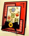
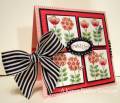
This is a really pretty color combo, except for the bravo burgandy. LOL. Okay, so I hate that color. I don't mind the cardstock, but the ink....oh my....it's so....bravo brown or something. So I only used the cardstock on my card, and hey, that worked! It's the ONLY SU color that I hate. Hate is a strong word, but dislike doesn't cut it. Luckily there is cherry cobbler, riding hood red, and even rich razzleberry that I use when I want a brighter hue. Anyway, the cardstock is actually pretty. Here is my card, I am still playing with this new saleabration set - Sweet Summer. So full of whimsy - hope you like it!~ Oh yah, and those butterflies, are fluttering in the "breezes" - (a little dessert never hurt anyone!)~ PSPS- someone also said in a comment -wow- love the brads......"look ma, no brads" - that is just the little dots that come out when you punch a 1/8" hole punch glued on and then covered with crystal effects)
Date: Monday, January 17, 2011 GMT Views: 4664
Favorited:120
Paper: Watercolor cs, pear pizazz, bravo burgandy, SU DP, very vanilla
Ink: black stazon
Accessories: markers and blenders, paper piercing kit, white gel pen, tiny heart punch, small heart embosslit, crystal effects, border scallop punch, burgandy satin ribbon
Registered: September 12, 2004 Location: Redmond, Washington Posts: 54468
Mon, Jan 17, 2011 @ 10:21 PM
This is at the top of my list. I love what you've done with it here. Stampin' Up needs to hire you as one of their sample makers, you'd sell a ton for them!
------------------------------ This is the day that the Lord has made. Let us rejoice and be glad in it.
Registered: October 29, 2006 Location: Buffalo, NY Posts: 4100
Tue, Jan 18, 2011 @ 1:18 AM
Gorgeous! So colorful! I agree about that ink...dislike is not strong enough!
------------------------------ My blog: Kind Creations
Designing for Just Us Girls challenge blog! Til the next time that we say goodbye, I'll be thinking of you! (The Rolling Stones]