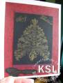
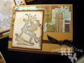
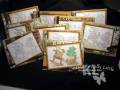
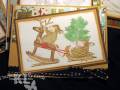
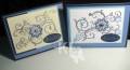
Here is my set of 10 cards created rather simply for the CCC08 Christmas challenge. I colored the first one with my prismacolor pencils and used OMS to blend, but I also like the vintage look of the black and white images sponged lightly with just creamy caramel around the edges. I may color them in, but I may leave a few uncolored as well.
To color or not to color?! Let me know what you think.
Stamp: On Dancer On Prancer (House mouse image from Stampa Rosa)
Ink: Archival graphite black, creamy caramel
CS: Creamy caramel, chocolate chip, white, and dp is Figgy Pudding
Acc: Faux brads (punched paper dots), chocolate chip and black double stitched ribbon. There is some Sakura gel glitter pen and CE on the colored on as well.
I have made more simple layer cards this year after realizing how expensive it can be to send out 50-60 cards with extra layers and embellishments last year. Phew!
Date: Monday, July 21, 2008 GMT Views: 685
Favorited:4
Registered: July 28, 2006 Location: Columbia, Maryland Posts: 13497
Mon, Jul 21, 2008 @ 3:22 PM
Wow! Both look great, but I do like the fresh look of the uncolored "vintage look" images! HM stamps are always so cute; not seen this one before --TFS!
Registered: March 5, 2006 Location: CT Posts: 1087
Mon, Jul 21, 2008 @ 6:24 PM
They look good both ways, I thought it would be too plain to leave them uncolored, but you made them look great.
------------------------------ Live your life is such a way that when your feet hit the floor in the morning....Satan shudders & says: "Oh no, she's awake!"
Registered: August 8, 2007 Location: Minnesota Posts: 1519
Mon, Jul 21, 2008 @ 7:28 PM
Both are great, but the colored one looks more complete. Have you thought about just coloring the one mouse on the rocking horse, as if all the rest is a dream to that little mouse.
Just a thought,,, but great cards no matter what you already did a great job!
~M
Registered: October 5, 2005 Location: Tina and Lena Posts: 11872
Mon, Jul 21, 2008 @ 8:16 PM
Oh Kelly I like them both! But I think I like the colored one best!!! I'm not very big on the ones with no color for myself when I do one I feel like it's not finished!
Registered: April 13, 2006 Location: last house on the left. Posts: 2596
Tue, Jul 22, 2008 @ 10:35 AM
I like both ways. But what about just a touch of color on the black and white ones, say coloring just the tree or just the reins. Not sure, but just a thought
Registered: February 5, 2007 Location: Arizona Posts: 158
Sat, Aug 02, 2008 @ 6:39 PM
My take on your cards is that the colored one catches my eye more, but so you don't have to kill yourself, how about the spotlight technique in some area?