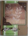
I love your gallery, Sarah...so many beautiful cards and projects to choose from. I chose this one first: CC140 by sarah green at Splitcoaststampers
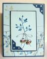
I hardly ever intentionally pull blue paper out so thought I'd give this a shot with blues. I like the pom better, but this turned out okay.
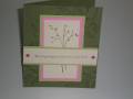
I kept the layout exactly as is. Same stamp set, different stamp. Changed paper and cord colors. Kept the corners, used rhinestones instead of pearls and charms instead of tags. The charms say hope and believe. Probably more of a copy than a case. Thanks for the inspiration, Sarah.
Thanks for looking.
Date: Sunday, February 10, 2008 GMT Views: 1388
Favorited:13
Registered: February 1, 2005 Location: Temple, Tx Posts: 37720
Sun, Feb 10, 2008 @ 6:22 AM
Oooooh, I love the blue... don't know why I don't use it more often! So delicate with the lovely background and the charms...I also love how you alternated the corners...beautifully done!!
Registered: October 20, 2004 Location: St Charles MO Posts: 1453
Sun, Feb 10, 2008 @ 7:16 AM
The blue is perfect for this card, it really sets the whole card up for the rest of the fab stuff on it, love your embellishments, and placement of those photo corners. tfs