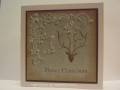
This almost went in the trash! I was near tears because I thought I had ruined a perfectly good piece of designer paper. I stamped the flourishes in wheat chalk ink, then layered spanish olive chalk ink on top. It was awful!!! I stamped the stag head, hoping it would be fine... It got worse. I really {heart} this dp, and I was {heart} broken that it was ruined.
I decided in this case simple was NOT the way to go. I really tried to make this simple, but it crashed. I decided to really emphasize the ubitz! That's a lesson I learned from seamstressing (go to my blog for that story!). I used my zig painty to emphasize the green berries and stickles for the lighter berries. I outlined the pale flourishes with my white gel pen. Then I think I went a little gel pen happy - I started free handing more flourishes and adding more berries. And then I decided the stag needed a little frosting - well then, so does the sentiment.
Registered: January 26, 2007 Location: Fredericksburg, VA, but originally from Scotland!:) Posts: 12742
Sun, Nov 25, 2007 @ 5:27 PM
Great save!! So glad you didn't trash it, because it turned out beautiful! I love the shadow effect and I love the colours! Thanks for sharing your story on how you saved this beauty!!
Registered: January 29, 2006 Location: Mount Forest,Ontario Canada Posts: 11597
Sun, Nov 25, 2007 @ 5:41 PM
I agree; this caught my eye. It looks subtle and simple but it is gorgeous, I'm so glad you were able to play with it and like it after all that creative energy was spent.
------------------------------ Michele
My God shall supply all your need…Philippians 4:19