I posted this thread in the General Stamping forum, but in case you can't view the attachment, I'm putting the pic in my gallery, too. Forums at Splitcoaststampers
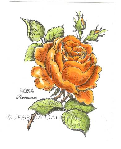
I've just started playing around with my new Copic markers and would like some advice on my shading and highlights. I know that I'm heading in the right direction, but it's still very amateurish and I'd like to improve, but not sure how. I know the light direction should come from one place, here it's from the left front, but I don't know how much highlighting is appropriate or what shape and size it should be, especially on the rose petals. Do you know what I mean? Can you tell I'm a perfectionist? LOL!
One other thing, no matter how hard I try, I can't get my Lipstick Red to blend! I used Lipstick Red, Chinese Orange, Chrome Orange, Yellowish Shade and Pale Yellow for the flower; those were my only orange/red/yellow markers that I own. The leaves were done with Yellow Green and Pea Green and a little Olive. Again, I am very limited in colors(for now!).
Date: Monday, November 12, 2007 GMT Views: 584
Favorited:2
Registered: April 5, 2005 Location: Me and my new haircut!! Posts: 21375
Mon, Nov 12, 2007 @ 7:47 PM
I don't have any copics, but your shading looks fabulous!! You might want to try maing the inner petals a little darker and the outer ones a little lighter since they fade in color as they open. I love how you did the dark and light though!!
------------------------------ Barb aka Shroom Head stalker
Registered: December 2, 2006 Location: Jackson, TN Posts: 7832
Mon, Nov 12, 2007 @ 8:34 PM
I don't know anything about Copic, other than seeing examples- but I do know that this is a marvelous coloring job! Well done.
------------------------------ Diane If life was fair, Elvis would be alive and all the impersonators would be dead. Johnny Carson Please visit My Gallery and My blog Planted in Joy
Registered: December 13, 2006 Location: Abbeville, La. Posts: 657
Tue, Nov 13, 2007 @ 3:58 AM
Your kidding right??? This is magnificent. Great Job. TFS
------------------------------ Life is Way to Short NOT to be QUEEN. side note: IF YOU ARE WAITING FOR SOMEONE TO PLACE THE TIARRA ON YOUR HEAD... DON'T!!! Get your own and be Queen.
Registered: February 13, 2005 Location: Southern Ontario Posts: 26256
Tue, Nov 13, 2007 @ 7:50 AM
Your shading is wonderful. You don't have to completely cover the image with colour. The best way to get light reflection is to leave white paper showing. That makes the contrast more pronounced.