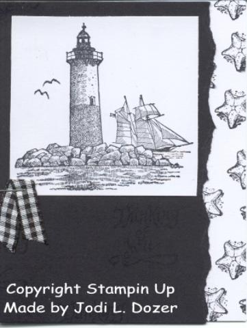
Ok, it's after midnight and maybe that's why I'm not happy with this card The black background cardstock has been stamped with "thinking of you" in versamark.
I think the white is too stark ?? Should I do anything to tone it down?
What about the main image - should it be torn out?
Any other suggestions?
for Aug/Sept issue
nautical
not selected
Date: Sunday, January 9, 2005 GMT Views: 1594
Favorited:26
Registered: April 6, 2004 Location: Michigan Posts: 1264
Sun, Jan 09, 2005 @ 7:46 AM
Wow, this is great. I find that instead of using white on black, almost amethyst or bordering blue works well too; it's not so striking. I think white works here!
Registered: November 7, 2004 Location: On the beautiful Canadian Prairies. Posts: 4140
Sun, Jan 09, 2005 @ 9:08 AM
I think its fantastic. Scanning doesn't usually do the cards we make any justice but this card looks great here so it must be PERFECT in person. I love the black and white cards ! TFS
------------------------------ ~*~*~ Wendy ~*~*~
Mom to Chris (6) & Debbie ( ! Wife to fantastic hubby Don !


 !
!