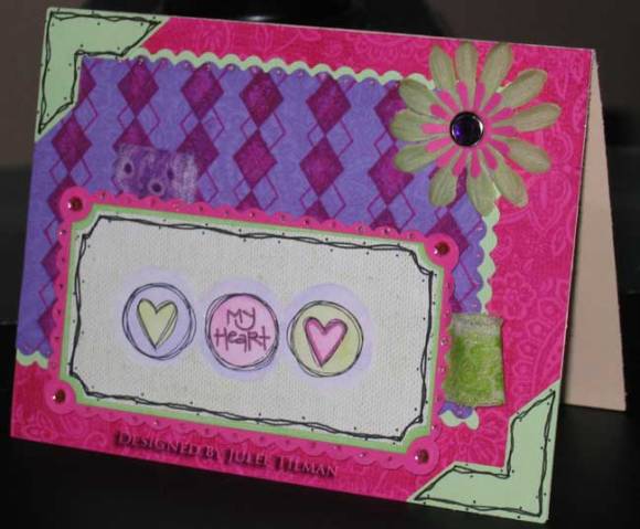
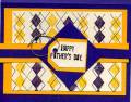
Okay, so this one's another beast of a card. I was determined to do the color challenge, even though I just couldn't find a way to make these colors work for me! Probably should have just sat this one out - it is definietely not my style! The card does actually look better IRL than in the photo. The three hearts stamp is from Mike's $1 bin. I colored with watercolor crayons and added a few accents with my stardust gel pen. The sketched frames are hand doodled. Tried to use these fabric strips I got on clearance from Shoebox Trims and my All Around Argyle set that I never use because it's such a pain to line up - even with the SAMJ!
Date: Wednesday, January 10, 2007 GMT Views: 1154
Favorited:2
Your card is wonderful!
These are not my first choices for colors (I'm not at all a Bold Brights person) but you made this combination very pleasing to the eye with your use of the white cardstock, which breaks up the boldness of the other colors.
Thanks for sharing.
Registered: December 30, 2004 Location: Where ever I go...there I am! Posts: 64166
Wed, Jan 10, 2007 @ 6:30 AM
LOL- a beast of a card made me laugh!
You do have a lot going on but I like it, anyone that can work those colors deserves high honors. They scared me and for once I was glad I didn't have but one of them! TFS!