Registered: May 12, 2006 Location: Lookie what I got for Christmas! Posts: 4679
Mon, Oct 02, 2006 @ 5:42 AM
Hi,
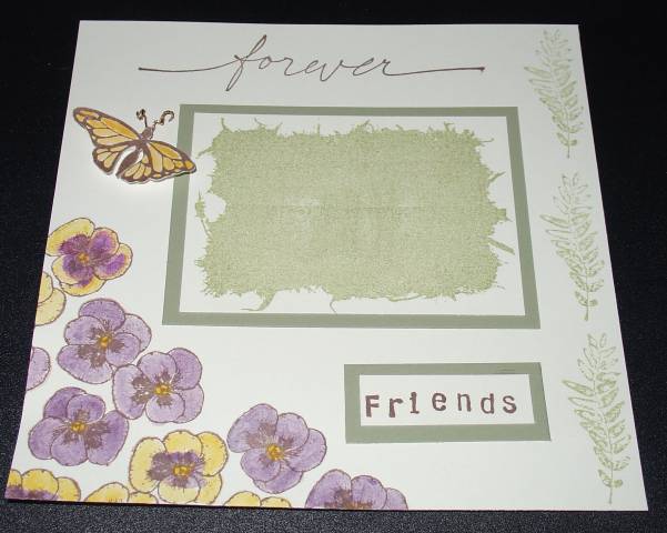
I like the colors you chose. How about adding some dimension to the page? Maybe stamping more flowers and using popdots to make it look more like a blooming garden? Also, not crazy about the ferns up the side. IMHO, less is more.
Registered: March 18, 2005 Location: Driving round in circles Posts: 12992
Mon, Oct 02, 2006 @ 6:24 AM
Cyndi, wow, I so disagree with the first poster, I love the ferns. The two different fonts look great and I think that the coloring on the flowers is so pretty. The butterfly really finishes the page off, you did a wonderful job and I would be so happy if I could produce a page like that.
I normally don't click on to look at scrapbook pages, but this one really caught my eye! This is beautiful! I also think the ferns balance out the page and the butterfly adds dimension to it. I know a lot of my scrapbooking friends purposefully do NOT much dimension to their pages cause they don't like their scrapbooks to be bulky. Nice page!!