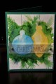
Adding to my Christmas stash for Angie's challenge. I tried the vintage watercolor technique again, but am not thrilled with the results this time. I think I should not have used black for the music notes in the bg, it is too stark and makes the image look dirty. I also struggled with the base layer, and regret using the creamy caramel. It just doesn't feel Christmasy enough. Close to Cocoa is what I used for the die cut frame, and decided to glam it up by sponging gold ink onto the paper. I sponged the sentiment edges with gold as well. Layered both pieces onto creamy caramel that was embossed with the woodgrain ef.
Date: Wednesday, August 3, 2016 GMT Views: 305
Favorited:2
Registered: July 9, 2008 Location: Stars Fell on Alabama Posts: 74778
Wed, Aug 03, 2016 @ 8:05 AM
That's such a pretty die for that wonderful image. I think it is a marvelous Christmas card.
------------------------------ My Blog---My Gallery---My PinterestI'm a Punchkateer! (Prez) FOREVERDirty Dozen Alumni2014 CAS Spring DT--- Inspiration Challenge Co- Hostess 12/02/17-12/28/19 Watercolor Wednesday Design Team Hebrews 13:2Brenda
Registered: October 12, 2007 Location: Arizona Posts: 70216
Wed, Aug 03, 2016 @ 8:41 AM
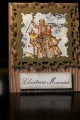
This card has the vintage look. Could have come right from Dickens' era. I like the glow that you gave to the lamp. The ornate die-cut frame accentuates the look. Well done. TFS
I like the black notes!! I think this looks wonderful! Your image glows with beautiful sepia tones and I love the black. Thanks so much for playing along with my challenge!