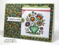
I used this week's sketch and this week's colours of orange, turquoise, and white to make this all purpose card. I coloured my stamps with markers and lightly spritzed them with water before stamping. The tree is a second impression from the colouring to lighten it up a bit. The orange and blue made a green where they overlapped but that was unintentional! :-)
ETA: This dull day has made my turquoise look sort of like a powder blue and subdued the orange quite a bit too!
Date: Friday, April 1, 2016 GMT Views: 770
Favorited:4
Registered: January 6, 2004 Location: Connecticut Posts: 20543
Fri, Apr 01, 2016 @ 8:52 AM
What a cool way to use this week's colors and sketch!
------------------------------ Rediscovering the simple joy of stamping and exploring my art! Stamp your ART out! Share your thoughts. Let your heart sing.
Come check out my Gallery and leave a comment!
FS465
Registered: September 12, 2007 Location: Wake Forest, NC Posts: 61357
Fri, Apr 01, 2016 @ 7:25 PM
How perfect this is, Ms. Dockside. How creative to use those 2 color challenge colors, too. Yes, I have to agree: There's very little else that can take the place of sitting under a mature tree in the shade. It's a gift from God, as I see it. Lovely card, Ann.
------------------------------
Art Neko and Prickley Pear DTs
Former DT Dolce Designs, Rubbernecker, StampItCrazy,
I Brake For Stamps
DO U KNOW?
BRAK members love to send SCSers cards on their birthdays? Come join us.
"Do not go where the path may lead; go instead where there
is no path and leave a trail." ... Ralph Waldo Emerson