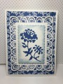
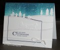
My inspiration is this dinnerware: http://www.horchow.com/NM-EXCLUSIVE-...&cmCat=product. The flower die is from Die-namites and the frame and insert dies are from Ellentina. The paper for the flower and the dark blue background are the front and back of the same sheet of patterned paper. The dies and the paper would all be classified as "old stash."
Date: Friday, August 28, 2015 GMT Views: 1488
Favorited:8
Registered: October 21, 2010 Location: in the okanagan in b.c. canada Posts: 13012
Fri, Aug 28, 2015 @ 10:24 PM
Oh my fav. color..and in dinnerware too...so cool. reminds me of that style...um....delph ? blue. Such a pretty lacey edge and your dp a perfect match for that pretty flower...TFs..:0)
------------------------------ We as people are raindrops of colorful ink , falling down Crisp and Clear, each a different shade more vibrant then the last, but once we realize at the bottom of an endless abyss we all fall into the same inkpot forming one color, only then can we come together as one My son.
Registered: February 5, 2007 Location: St. Louis, MO Posts: 92537
Sat, Aug 29, 2015 @ 3:38 AM
You really captured the lacy overall feeling of the dinnerware with your card. The fancy frame die cut over the heavily pattern DP helps to give that effect. The polka dot DP for your flower die cut adds to that feeling too....rather than if you had used solid blue. A lovely and striking card.
Registered: August 21, 2007 Location: Wayland MA Posts: 105198
Sat, Aug 29, 2015 @ 10:14 AM
Just beautiful, and has the same feeling as the dishes you used for inspiration. Lovely card.
------------------------------ Anne HarmonFS154, QFTD58, PROUD FAN CLUB MEMBER (photo of our Great Granddaughter Elise, just 6 months old) and me, even older.