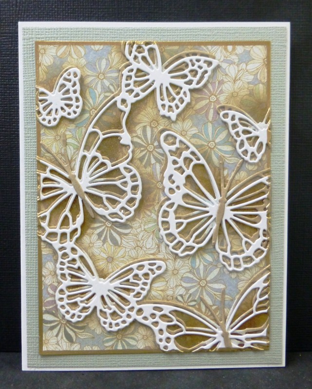
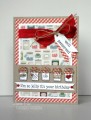
The colors for today are metallic gold and white(vanilla).
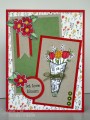
Dessert = butterfly
I added more neutrals to my card with Kraft and light gray. IRL there is a golden shimmer to the whole back panel.....as per usual, it doesn't show in my photo and I'm finished sweating it. At some later time, I might add a vellum label sentiment when I know the occasion for the card.
TFL
Date: Monday, August 24, 2015 GMT Views: 2988
Favorited:11
Registered: February 21, 2007 Location: Bay City, MICHIGAN Posts: 17556
Mon, Aug 24, 2015 @ 9:31 PM
A neutral masterpiece, Sallie! I love the contrast of grey with the kraft and white - gorgeous DP in the backgrounds and you KNOW how much I love butterflies!
------------------------------ SUE aka GREENIE - Twisted Sistah Handmade cards because..No one displays an email on their mantle, or saves a FB post in a box of treasures! Nothing is impossible with God!
Such a beautiful card! I love the way you layered the die cuts for dimension and the colors and background look wonderful together. Going into my favorites!
Splitcoast Dirty Dozen Creative Crew SU Design Team Alumni
Registered: May 18, 2004 Location: Southwest Michigan Posts: 36983
Tue, Aug 25, 2015 @ 7:46 AM
Your layered butterflies look amazing against that subtle designer paper, and I can imagine the shimmer in my mind; it is SO hard to get shine to show in a photograph without just having big blobs of light bouncing off it!
------------------------------ Claudia Splitcoast Fan Club Member