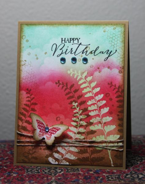
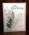
I have to laugh at myself. In my haste to get a card done last night, I apparently mis-read the instructions. I thought you had to use ALL of the InColors and I did get them all included in my design. I tried a technique that usually fails, but this time I got it to work. I sponged Pistachio onto the corner of the cardstock before clear embossing the fern. That allows you to sponge over the image with darker colors and the pale green shows through. And also, if I was paying more attention to the instructions I would have subbed in sequins instead of gems. But all in all I am happy with the final results.
I used a scalloped circle to create some cloudy texture, used the grid and dotted stamp to create the vintagey distressing.
Thanks for viewing and commenting.
Date: Tuesday, May 12, 2015 GMT Views: 4045
Favorited:17
Registered: March 9, 2005 Location: OH Posts: 28546
Tue, May 12, 2015 @ 6:36 AM
Kathy, I thought the same thing! LOL Your card is absolutely gorgeous! Love your clouds and the pink behind the ferns.
------------------------------ My Blog- Trusting in the Lord for Everything Proverbs 3:5-6 Trust in the Lord with all your heart and lean not on your own understanding. In all your ways acknowledge Him and He will make your path straight. My Stampin' Up WebsiteMy Gallery, BRAK New Member Mentor. New Grandmother to Mia Lou. 1st Grandchild.
Registered: February 5, 2007 Location: St. Louis, MO Posts: 92457
Tue, May 12, 2015 @ 6:46 AM
This is beautiful, Kathy. LOVE how you blended the colors in your bg in addition to the other patterns you included like your ferns, netting, spatters. The sweet butterfly is the perfect focal point.
Registered: January 20, 2010 Location: Brampton, Ontario Posts: 26123
Tue, May 12, 2015 @ 8:48 AM
Love your embossed resist technique! I have never done well with that one. This is inspiration to try again! These colours are being used for the most amazing natural scenes today. I love how your ferns and billowing clouds look! The butterfly is the icing on the cake here. TFS
Splitcoast Dirty Dozen Creative Crew SU Design Team Alumni
Registered: May 18, 2004 Location: Southwest Michigan Posts: 37076
Tue, May 12, 2015 @ 9:49 AM
Vibrant and beautiful! I love that fern (thanks for sharing that tip to get the pale colors to show through - I have never thought of this, and the effect is great). Your layered butterfly with the text is a perfect finishing touch.
------------------------------ Claudia Splitcoast Fan Club Member
Registered: August 21, 2007 Location: Wayland MA Posts: 105101
Tue, May 12, 2015 @ 12:06 PM
I thought we had to use them all too. Must read directions better.....we should form a group!!! I love the ferns!!
------------------------------ Anne HarmonFS154, QFTD58, PROUD FAN CLUB MEMBER (photo of our Great Granddaughter Elise, just 6 months old) and me, even older.
Registered: August 15, 2007 Location: Twin Cities MN Posts: 50503
Tue, May 12, 2015 @ 12:49 PM
WOW Kathy this is a work of art!! I applaud you for getting in all the colors..not easy. Thanks for explaining how you did this..the gradation of color is wonderful! A gorgeous, gorgeous card..I can't stop looking at it!