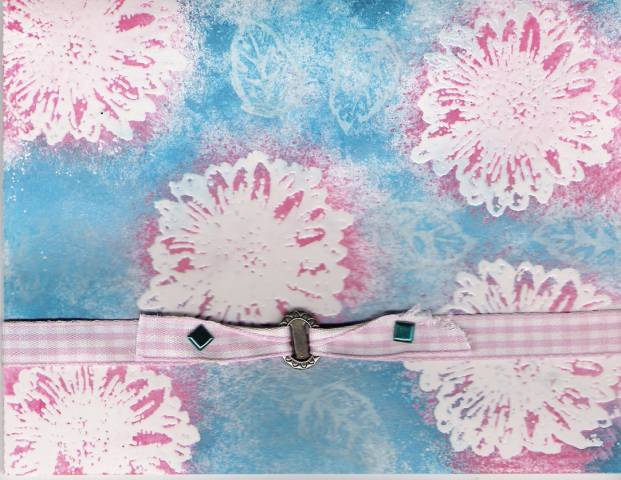
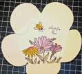
This is for TLC57......Resist Resist. I really don't like it, but I struggled with sponging the colors on all 3 that I tried. What am I doing wrong? Most that I've seen have gotten beautiful, and even, coverage.
Date: Monday, March 27, 2006 GMT Views: 480
Favorited:3
Registered: June 29, 2005 Location: along the country roads of WV Posts: 3852
Tue, Mar 28, 2006 @ 10:53 AM
I think this is very pretty also. I'm not sure why you think the color isn't even...is it the Blue or the Pinker tones that aren't even to you. Your versamark images are showing thru the blue really well and your white flowers (i'm assuming they were embossed) are showing up really well on top of the pink color. In my mind that is the way this is suppposed to look. I really like how you used the two colors, I think it creates a lot of interest done this way!
------------------------------
Barbg(WV)
This is the day which the LORD hath made; we will rejoice and be glad in it. Psalm 118:24