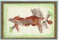
Still working on texturizing and masculine cards. Not achieving the effect I'm after, but I'm not quitting!!! I feel like I'm missing something - please feel free to add any comments that might help me make these cards better. Thank you!
Date: Wednesday, November 23, 2005 GMT Views: 326
Favorited:2
Registered: February 10, 2005 Location: the great white north Posts: 37666
Wed, Nov 23, 2005 @ 2:22 PM
the green adds alot of interest in this. i really like how the green is stronger by the branches.....the glitter also adds some depth. i think you did a wonderful job.
Registered: March 13, 2005 Location: Washington Posts: 295
Wed, Nov 23, 2005 @ 2:41 PM
Oh I really like this, it will be very striking once your all done. I would consider adding some black (hand drawn) lines to the cat. I can't clearly tell where his head is from his body.
------------------------------ Rebecca
Mom to Bryce (2.9) and Vivian (1.75)
Registered: October 20, 2004 Location: Austin, TX Posts: 396
Wed, Nov 23, 2005 @ 2:52 PM
Thanks for the advice Rebecca. I thought about this also. The bad part about the tissue and ink is that it bleeds. This stamp has small detailed parts right around the head and neck so it all ran together. I wasn't sure how to separate it. Maybe I will try a lighter color next time and then do a little black in it free-hand afterwards, or at least with a darker marker. Good idea. Thanks for helping out!
I might leave some of the litter off up towards his head also - as an afterthought... might help a little too.
Registered: October 20, 2004 Location: Austin, TX Posts: 396
Wed, Nov 23, 2005 @ 3:36 PM
I don't know - that's an idea... will try it. I wonder if it will tear the tissue. That stuff sticks pretty good sometimes. Won't hurt to try tho. I'll get back to you.