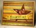
Oh I'm so not happy with this...in my head it looked really cool! It was supposed to be grungy in a Tim Holtz sort of way, but it fell so short of the mark it just looks grungy, in an 'oops I stepped on my card' sort of way. :0 This is for the Free4all today to use a star and some gold.
Thanks for looking!
Deena
Date: Friday, July 2, 2010 GMT Views: 530
Favorited:3
Registered: March 16, 2005 Location: St. Louis, Missouri Posts: 17867
Fri, Jul 02, 2010 @ 9:39 PM
Deena- I really like your card- looks TH grungy to me. I like how you added the stamped off stars to the background paper and the way you did the sentiment banner. Maybe you need to get your eyes checked b/c it really is fantastic!
Registered: June 9, 2009 Location: north dallas area Posts: 248
Fri, Jul 02, 2010 @ 10:33 PM
I bet if you made the sentiment black so it would pop off the card then the 'stepped on' look would go away. Maybe it's the fact that it's ALL grunged... I would try that and see if it makes you happier. I love it - I am always in need of good boy cards and this one a good example.
Registered: July 1, 2007 Location: small town near montreal, quebec Posts: 26677
Fri, Jul 09, 2010 @ 6:30 AM
Awww, how hard we artists are....Look at all the kind comments and real appreciation for this ooops card! Love it Deena. I understand though, I made a card yesterday that I thought was horrible at first, but when looking at it longer, it does have charm. LOL
Yours on the other hand could not be mistaken as a mistake. It's so beautiful, the grung is good, the star great and yes, I am sorry not to agree with you, but you know that's what friends are for!


 Maybe it's the fact that it's ALL grunged... I would try that and see if it makes you happier. I love it - I am always in need of good boy cards and this one a good example.