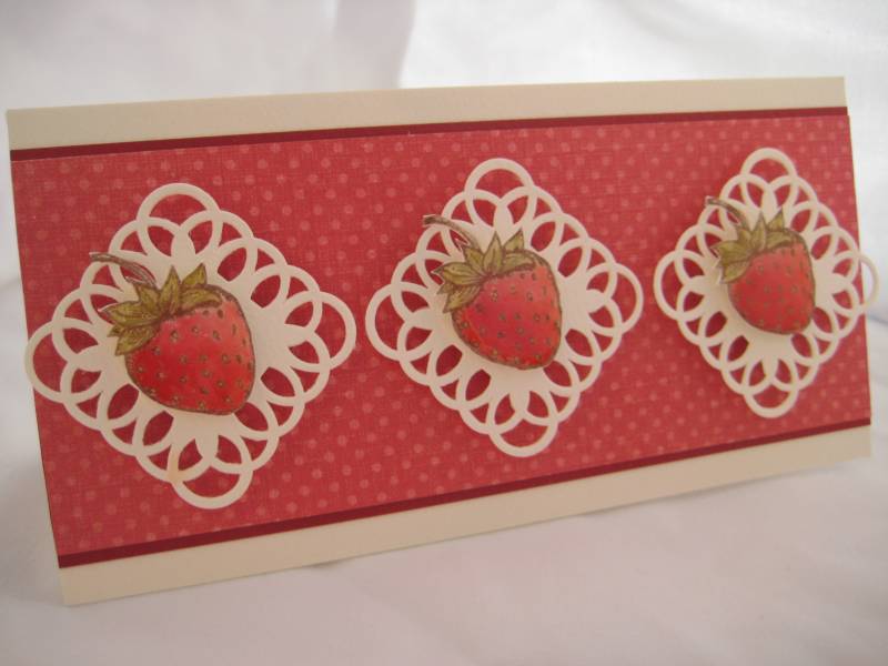
I revised my Strawberry note card based on suggestions from Ladies on a thread about how to improve a card I used a couple of the ideas they suggested and this is the new and improved version
I used Diamond Glaze on the berries themselves, as per one of the suggestions and I agree (so does my husband) that it looks better this way and not so flat looking. I hope you can see the depth it offers.
I also turned the squares on their sides/tips and I like it this way better as well.
And although someone suggested to use green as an accent, which I wanted to do, but couldn't find a good green, I used cream as my accent color. I think it lightens it up a bit better. All the greens looked too "neon" along side of this red DP.
So those are the changes based on some great tips (Thank You Ladies!!) and I DO like this one better!!
Date: Tuesday, June 8, 2010 GMT Views: 1346
Favorited:7
Splitcoast Dirty Dozen Alumni SCS Gallery Moderator Splitcoast Challenge Hostess Teapot Tuesday TEAm
Registered: July 27, 2007 Location: Dublin, Ireland Posts: 131425
Tue, Jun 08, 2010 @ 12:10 PM
I'd still have liked to see some green, but aside from that (and if you didn't have the *right* green, better off without any), this looks great to me. It's definitely got a lot more punch and impact than your first version, between the extra layer of matting and the white panels.
This looks fantastic. I love the changes you have made. The strawberries really stand out now. In fact they look so good that I'm thinking of strawberries and cream and want to taste them!!
Happy 9th anniversary.


 I used a couple of the ideas they suggested and this is the new and improved version