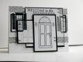
One more try at the card with pieces.
I like this one better, but my stamping was too heavy and the ink is a bit sloppy. I do like the contrast of the black/grey and white though.
Date: Saturday, May 8, 2010 GMT Views: 881
Favorited:4
Registered: February 13, 2009 Location: Lansing, Mi Posts: 98
Sat, May 08, 2010 @ 7:57 AM
If you hadn't commented on the ink problems I would have thought it was all intentional, sort of expressionist (is that a word even) I really like this card, shows a lot of creativity.