I am going to be teaching a class for using Dream Weaver stencils, pastes, etc. One of the things the ladies want to learn is the faux tile technique.
Although I use my stencils and paste fairly often, I was never overly excited about the tile technique and never bothered to try it.
I decided I'd better give it a whirl so I would be competent enought to try to teach it to others.
This is my 2nd attempt at the tile technique. I had called our sales rep, Elaine Benedict (THANX Elaine!) for instructions for this technique. She was SO helpful.
One of the things she told me was to use Versa Craft ink, or oil paint sticks to do the coloring. I found out why she told me to use those 2 when I did this one.
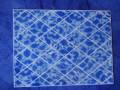
I wanted a dark blue floral image on a white background. I meant this to look like the wonderful ceramic items my best friend collects.
I didn't have a dark blue in Versa Craft or the paint sticks, so I used a Colorbox ink. Colorbox is a wonderful pigment ink...but it's not for this technique if you don't want your colors to blur.
I have a grungy VersaMark pad, a sorta grungy VersaMark pad, and a pristine VersaMark pad. The pristine pad is what I use when I'm going to do clear embossing.
Well, although I left this image lay around a couple hours before starting the embossing step, it didn't matter. When I took the finger dauber and started pouncing VersaMark onto the image, the dark blue ink picked right up and turned my white background AND my pristine VersaMark pad a "pretty" (ahem!) baby blue.
So...keep that in mind if you decide to give this technique a try. ;D
Date: Sunday, September 13, 2009 GMT Views: 103
Favorited:2
Additional Info
Stamps: None
Paper: misc. white cs
Ink: Colorbox Royal Blue, VersaMark
Accessories: Dream Weaver stencils, stencil brushes, light box, clear ep