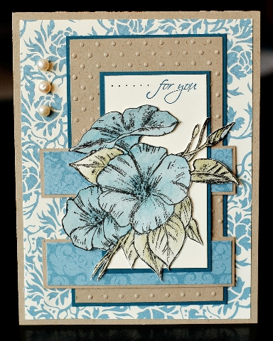
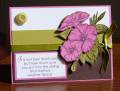
I have such a love/hate relationship with this dp. I love the colours but I hate that not quite navy doesn't seem to work with this paper even though it's supposed to. So I keep trying it, and I keep getting frustrated when it doesn't look right.
This is my second card for today's sketch challenge, my first one had a bold & bright look so I wanted to make one with a softer look. But as you see, it's a very busy card and I had a hard time getting the flower the right colour. First I watercoloured in not quite navy, it was way too bright. So I went over the whole flower with brocade blue which seemed to help tone it down a little. At least I tried, lol. TFL
Date: Wednesday, March 4, 2009 GMT Views: 1473
Favorited:17
Registered: April 3, 2007 Location: In a state of oblivion.... Posts: 14120
Wed, Mar 04, 2009 @ 6:38 PM
Well, whatever woes you had putting it together, I think it's a beautiful card - one I'd be happy to send or receive! So, be proud of it - it's great!
------------------------------ Heather ...... My Gallery You cannot do a kindness too soon, for you never know how soon it will be too late." Ralph Waldo Emerson Founding Member of the Punchkateerz - "You don't have to be crazy to be one of us, but it sure helps."
Registered: July 9, 2008 Location: Stars Fell on Alabama Posts: 74657
Wed, Mar 04, 2009 @ 7:12 PM
Beautiful job watercoloring your image and great card.
------------------------------ My Blog---My Gallery---My PinterestI'm a Punchkateer! (Prez) FOREVERDirty Dozen Alumni2014 CAS Spring DT--- Inspiration Challenge Co- Hostess 12/02/17-12/28/19 Watercolor Wednesday Design Team Hebrews 13:2Brenda