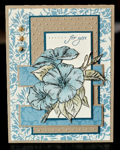
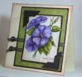
I have such a love/hate relationship with this dp. I love the colours but I hate that not quite navy doesn't seem to work with this paper even though it's supposed to. So I keep trying it, and I keep getting frustrated when it doesn't look right.
This is my second card for today's sketch challenge, my first one had a bold & bright look so I wanted to make one with a softer look. But as you see, it's a very busy card and I had a hard time getting the flower the right colour. First I watercoloured in not quite navy, it was way too bright. So I went over the whole flower with brocade blue which seemed to help tone it down a little. At least I tried, lol. TFL
Date: Wednesday, March 4, 2009 GMT Views: 1474
Favorited:17